


")

")


")
")
")


")
")
")


")
")

")


")


")

")

")


")


")


")

")

")


On Paperbacks and Alternate Covers
 This time last year, I was all like, “Sure, it sucks to miss out on a book tour, but
I’ll definitely be out there in 2021, once this pandemic blows over.” WRONG. I am still stuck in stupid Australia.
Australia isn’t stupid. I take that back. Australia is terrific. It’s like the rest
of the world but with the volume turned down. There are lots of problems with
people, I’ve decided, that only emerge once you put enough of them in one place. If
they can fill an entire news cycle with stuff that’s bananas, everyone starts feeling like
everyone else is totally bananas all the time, and maybe they should be bananas, too.
This time last year, I was all like, “Sure, it sucks to miss out on a book tour, but
I’ll definitely be out there in 2021, once this pandemic blows over.” WRONG. I am still stuck in stupid Australia.
Australia isn’t stupid. I take that back. Australia is terrific. It’s like the rest
of the world but with the volume turned down. There are lots of problems with
people, I’ve decided, that only emerge once you put enough of them in one place. If
they can fill an entire news cycle with stuff that’s bananas, everyone starts feeling like
everyone else is totally bananas all the time, and maybe they should be bananas, too.
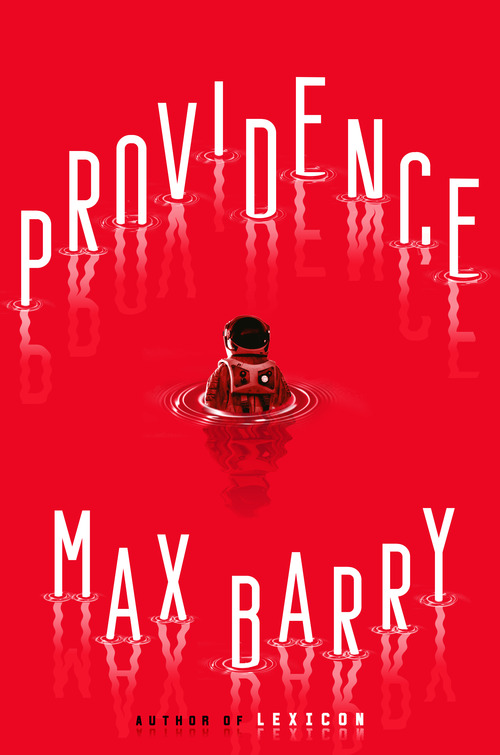
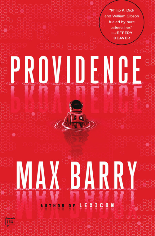
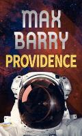
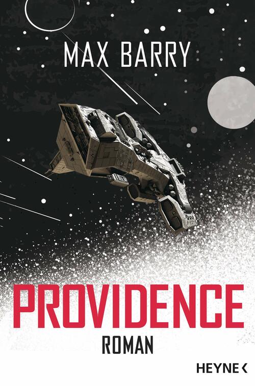
Anyway, my space book, Providence, hits paperback in the US and Canada today. It is actually a very nice-looking paperback. With hardcovers, publishers try to be all coy and unusual, but with paperbacks, they’re more like, HERE’S THE FREAKING BOOK. It’s more subtle this time around because the publisher is trying a bold new thing where they don’t completely throw out the hardcover design, but still, contrast and compare:
 ←Hardcover • Paperback→
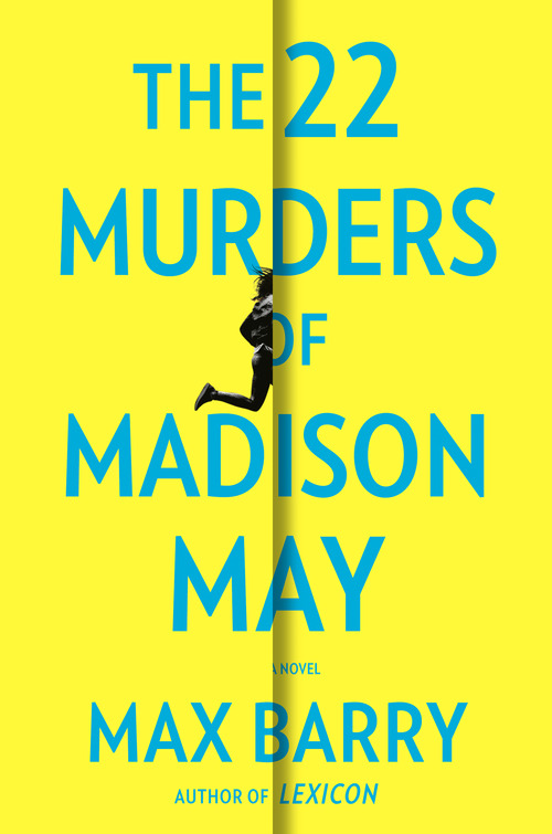
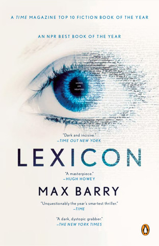
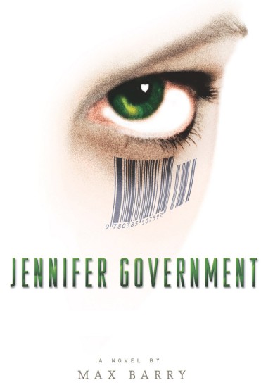
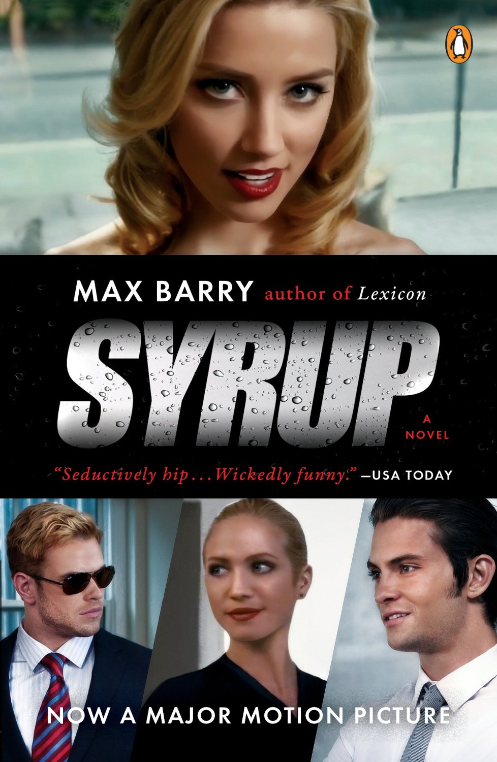
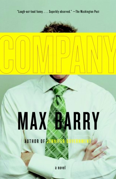
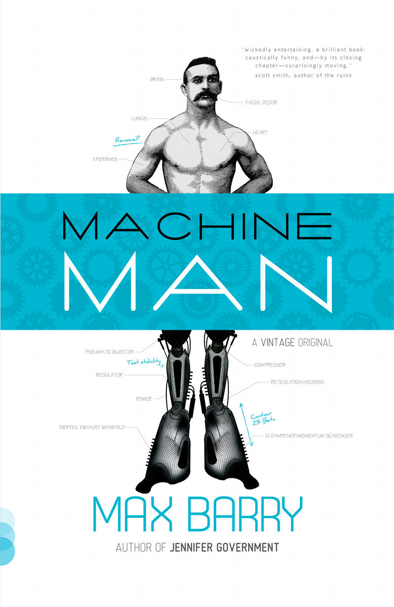
Also, just for fun, here are some covers I mocked up myself from back when the publisher asked, “Do you have any cover ideas of your own?” I always have cover ideas. Not good ones. But I have them. So, since I can’t tell the difference between politeness and a genuine question, I mock things up. Like this:
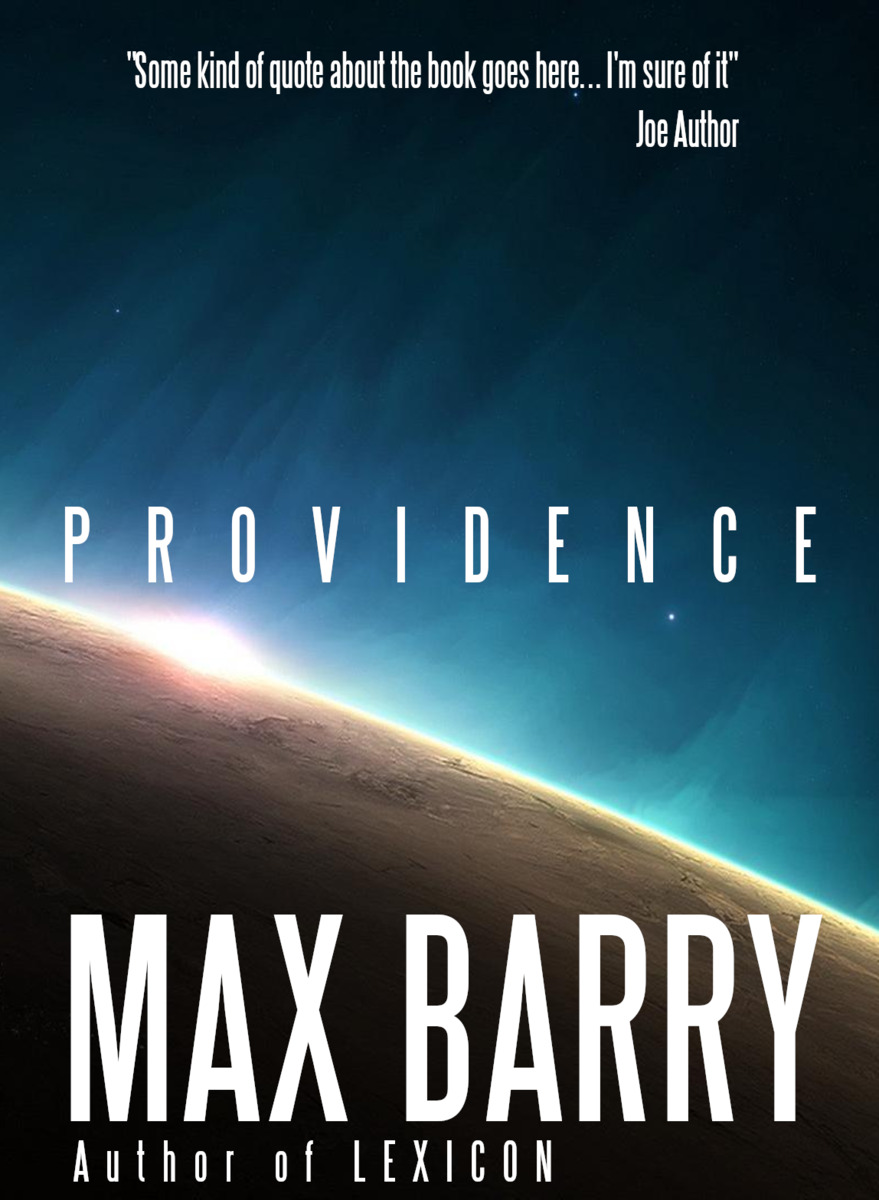
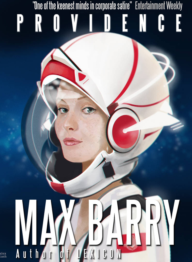
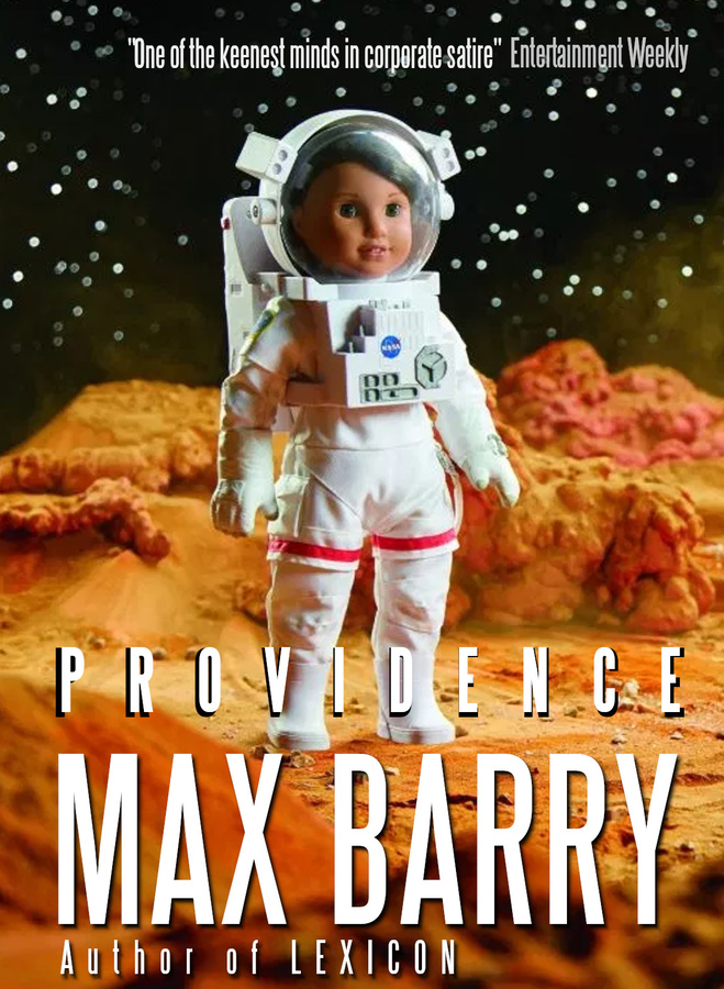
You might notice that all my ideas involve putting my own name in really big type. That’s just coincidence.
Finally, I have seen this but don’t know what it is. Large print edition, I’m guessing. Ironically, the image is tiny and difficult to see clearly.
If you don’t have a copy of Providence, and want one in paperback, you can find some buy links here. If you aren’t sure whether you want one in paperback, here is a list of amazing reviews. The Daily Mail says it’s “such a blast you almost overlook how clever it is,” and they’ve never been wrong about anything, so there you go.
Update: I missed one! There is also this German translation, which releases June 14, 2021. The Germans are usually pretty bold with their covers, but in this case they’ve gone for the tried-and-tested “honking big spaceship”. I have to say, I’m not a big fan of those lines that are supposed to show it’s moving really fast. I think we could do without those. But it is a neat-looking ship. The word “roman,” by the way, means “novel,” to make it clear that we aren’t actually sending AI spaceships off to fight aliens in real life.
 8 comments
Comments
This is where site members post comments. If you're not a member, you can join here. There are all kinds of benefits, including moral superiority!
Location: Canberra, Australia
Posted: 1897 days ago
www.amazon.com/Providence-Thorndike-Press-Large-Print/dp/1432882236
Ironically when you click "look inside" it shows the original red cover.
Jordan True (#4675)
Location: California, US
Posted: 1897 days ago
Location: Kansas
Quote: "Freeze!!! This is the Government!!"
Posted: 1897 days ago
towr (#1914)
Location: Netherlands
Posted: 1896 days ago
Admittedly I did buy it just because it says Max Barry on the front. But that only works for authors that I know I like.
An author name bigger than the title always gives me the impression the book is riding its author's coattails and isn't good enough to make it on its own merits.
Bill (#2812)
Location: Washington DC
Quote: "Impossible you say? Nothing's impossible when you work for the circus!"
Posted: 1896 days ago
Max, your posts are always a happy surprise in an email box that is usually quite dreary. Thank you!
Comfed (#8266)
Location: Nowhere
Quote: "Shrimp conspire behind closed doors."
Posted: 1895 days ago
Location: Melbourne, Australia
Quote: "I'm my number one fan!"
Posted: 1894 days ago
Yes, this is actually a big part of the red cover: there's an astronaut in some kind of liquid, which is weird and arresting, right, since astronauts are supposed to be in space.
The generic planet cover is lovely to look at but also, well, generic, so not memorable. It's probably a good cover for people who were going to buy the book anyway, because you'd like to have it on your shelf.
towr (#1914)
Location: Netherlands
Posted: 1893 days ago
Comments are now closed for this post.