


")

")


")
")
")


")
")
")


")
")

")


")


")

")

")


")


")


")

")

")


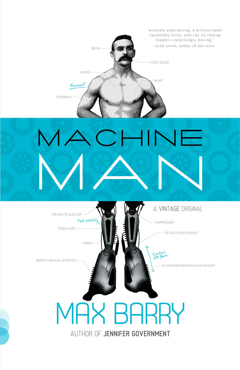
Choose the Machine Man cover!
 Something wonderful happened the other week: my editor asked what I thought about a proposed Machine Man cover. To appreciate how wonderful this is, you need to understand the usual process of publisher-author cover consultation. It goes like this:
- Publisher develops cover in secret laboratory guarded by Dobermans
- Publisher emails author a JPEG, accompanied by text emphasizing how much everyone they’ve shown this image to loves it and believes it to be a surefire winner
- Publisher puts image on the cover
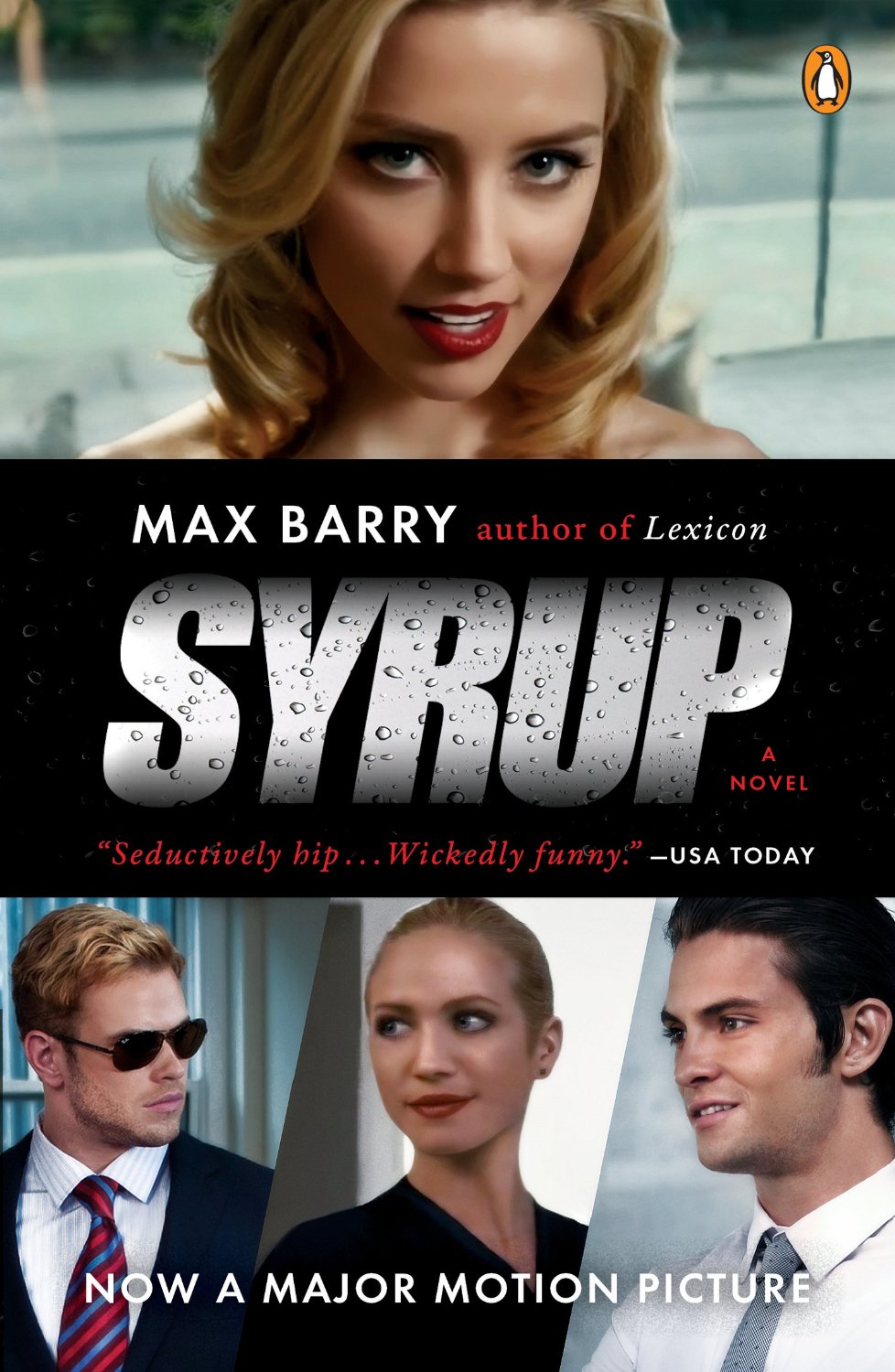
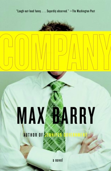
You notice there are no steps where the author does anything. I have tried to insert that step in the past, first with Syrup and then Company, but without much success. (To be fair, I was wrong about Company. That is a great cover. I was right about Syrup, though.)
This time, however, my editor at Vintage was ready for discussion. I don’t know why. I didn’t want to ask in case that accidentally provoked him into regaining his senses. But I made a few suggestions, even mocked up prototypes of my own, and Vintage responded with even more images.
Then I became really arrogant and demanding. It was around this point I realized why publishers don’t involve authors in cover discussions. Because I still wasn’t really in love with any of the cover ideas we had. And the cover is so important. Not just because it helps sales (although there is that): it also colors the story within. It’s the first thing you see and it stays with you as you turn the pages.
So next we brought on board indy designer Matt Roeser. This guy is incredibly talented and has somehow not been hired by anyone yet: this is potentially his first gig. Go look at his website; it’s beautiful. Anyway, once Matt had done his thing, we had six potential covers. Since I was already being a prima donna, I said, “I should post this online and ask people what they think.” And Vintage agreed! Like I say, it’s crazy. So here we are. Behold!
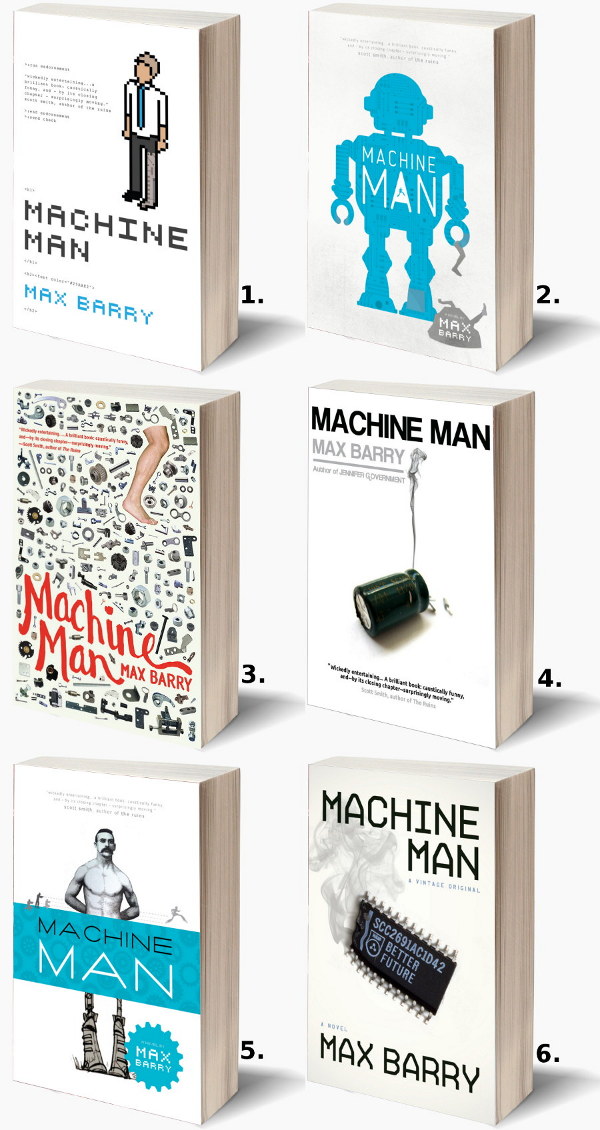
Here are larger versions of each image: 1 · 2 · 3 · 4 · 5 · 6.
Now we reach the part where you tell me which you like. There’s a comment link right there. I also posted to Reddit, because that’s where I drew a lot of inspiration for my main character’s personality. I’m not saying the site is full of misunderstood technology-obsessed geeks who would chop off their own hands if they could replace them with something WiFi-enabled. I’m just saying it was very helpful creatively. Also, I thought it was important to get opinions from people who don’t already like me. You’re wonderful people, you who visit me here. But you’re one hell of a sampling bias.
Please let me know what you think! Any and all feedback is much appreciated. And thank you to Vintage for being cool enough to let me do this. INSANELY COOL, if you know what I mean. I’m emphasizing INSANE. Oh. You got that? Okay.
 269 comments
Comments
This is where site members post comments. If you're not a member, you can join here. There are all kinds of benefits, including moral superiority!
Cory Lavalette (#52)
Location: Raleigh, N.C., USA
Quote: ""When Will Jesus Bring The Pork Chops?""
Posted: 5552 days ago
Mike (#5397)
Location: Australia
Quote: "5 rooms, including ceilings, painted for $5000"
Posted: 5552 days ago
#1 and #2 have been done to death.
#3 meh
#4 looks like a Dick Francis novel
#6 looks like a pop-sociology text
Erin (#1481)
Location: Seattle
Quote: "Living is easy with eyes closed"
Posted: 5552 days ago
Lauren Delgado (#5385)
Posted: 5552 days ago
Qaaolchoura (#226)
Location: Korea
Quote: "Treason never prospers, and what is the reason? If it does prosper then none dare to call it 'treason'"
Posted: 5552 days ago
I can tell you exactly why the others look wrong though: #1 looks clunky, #3 looks like it's a collection of columns (probably by Dave Barry), #4 and #6 look like they're hack thriller novels. #5 looks like you think you're Franz Kafka. Which makes it my second choice, actually.
~Q
Jennifer Gniadecki (#3308)
Location: Chicago-ish
Quote: "Happier than you and dragging you along for the ride"
Posted: 5552 days ago
The other ones remind me of either Max Headroom or..I don't even know what. Just...so very, very 80s faux-retro. Or something. I can't put my finger on it but only #4 had me singing, "One of these things is not like the others..." but in a GOOD way.
Thank you!!
Michael Fiedler (#1318)
Location: Lincoln, NE
Posted: 5552 days ago
ProfessorCFK (#5400)
Location: Washington, DC
Quote: "Freedom is an assault rifle"
Posted: 5552 days ago
Location: St. Louis
Quote: "WARNING: Extended Use Of Narflz May Cause Explosive Diarhea"
Posted: 5552 days ago
I really like #1, but I don't think its a great fit.
#2 is my second choice.
#4 and #6 are both solid and interesting.
Not a huge fan of #3.
Location: Philadelphia
Quote: "In this world, a man himself is nothing. And there ain't no world, but this one."
Posted: 5552 days ago
1, 2, and 3 are trite/overdone design-wise, and 6 just doesn't grab me.
Put a gun to my head and make me choose, I go with 4.
Location: Colorado
Quote: "Fiend is like Friend without the "R.""
Posted: 5552 days ago
#1 and #2 don't seem unique enough.
#3 is much too busy looking.
#4 I had to look at the thumbnail a second time to realize that was a capacitor and not a bullet casing.
#6 just didn't really do anything to catch my eye.
Jamie Cucci (#5401)
Location: Chicago, USA
Posted: 5552 days ago
We've only seen the first few chapters, so I'm basing this on aesthetics alone.
Cyma Khan (#3719)
Quote: ""With a gun barrel between your teeth, u can only speak in vowels." - TYLER DURDEN - Fight Club"
Posted: 5552 days ago
#2 is runner up finalist.
#6 isn't bad either.
#3 is very 'diary of a shop-a-holic-ky
#4 is very who-dun-it novelish
Wolfgang (#1368)
Location: Berlin, Germany
Posted: 5552 days ago
#4 would be my second choice, but preferably without the "Author of Jennifer Government" bit.
WhispersOfALostGirl (#5398)
Quote: ""I reject your reality and substitute my own""
Posted: 5552 days ago
I agree with Mike that 1 and 2 have been done to death. 3 is too busy. The cover isn't really recognizable enough for number 4. And 5 gives me a feeling of deja vu, like I've seen that before.
Tim K (#788)
Location: California
Posted: 5552 days ago
That would only add to your problems, so I will vote for #6. It has the advantage of avoiding the Scott Smith quote which, while well intentioned, smacks of damning with faint praise. Moving by the final chapter? The implication might be that the novel takes for ever to click into gear. If I were a casual reader and not an avid fan, I would not pay good money based on such a weak recommendation.
Elements of cover #5 work for me. Either the retro image with robot legs, or the stick figures chasing robo-stick figure. Having both is too busy. (And, of course, minus the quote.) Good luck and thanks for all you write and blog.
Location: England
Quote: "Don't Panic"
Posted: 5552 days ago
Location: Burnie, Tasmania
Posted: 5552 days ago
Niccalo (#2313)
Location: Duluth, GA
Quote: ""STOP! Don't Shoot!""
Posted: 5552 days ago
Jim (#2280)
Location: New York
Posted: 5552 days ago
Thomas (#1221)
Location: Germany
Quote: "One more, and I'm going to consider you my penpal."
Posted: 5552 days ago
syrup6 (#1224)
Location: Arkansas
Quote: ""Truth always rests with the minority, and the minority is always stronger than the majority, because the minority is generally formed by those who really have an opinion" - Kierkegaard"
Posted: 5552 days ago
Justin (#2009)
Location: Halfmoon, NY
Quote: "Max(x) is awesome!"
Posted: 5552 days ago
Jeff Wishart (#2742)
Location: Canada
Quote: "Everything in moderation, even moderation."
Posted: 5552 days ago
Location: Des Plaines, IL
Posted: 5552 days ago
Aaron the Evil HR Guy (#2252)
Location: Denver
Quote: "'The HR Department is a breeding ground for monsters' Michael Scott"
Posted: 5552 days ago
#2: probably my favorite: it has that classic sci-fi look
#3: too busy
#4: what the hell is that thing?
#5: not bad
#6: probably my second choice
regardless of which one gets chosen, make sure your name is BIG, like in #6! I think your reputation as a writer is the biggest selling point.
Location: San Diego, CA
Quote: "Hrowar!"
Posted: 5552 days ago
#2 looks to be more about robot uprisings than cyborganics, #5 is a bit too blatant about actually giving away plot (he's gonna get shot at! While running!). #4 and #6 could be about anything regarding THE HORRORS OF TECHNOLOGY and I don't remember any scenes centering around a burnt out chip or transistor. #3 is just a cluttered mess and the less said about it the better.
Steve (#2499)
Location: Michigan
Quote: "Max Barry's writing rocks. And he didn't even pay me to write that."
Posted: 5552 days ago
But without modifications to anything, I'd pick #5. I agree that I wish the legs looked more realistic than cartoony. But if the covers can't be changed, this would be my pick.
Location: NYC
Posted: 5552 days ago
Location: Toronto
Posted: 5552 days ago
Chris McBride (#1977)
Location: Belfast, N.Ireland
Quote: "Plagiarism saves thinking time"
Posted: 5552 days ago
Joshua Smith (#1968)
Location: Oregon, USA
Quote: ""I have a dream...I want to be famous. Really famous." - Scat, Syrup"
Posted: 5552 days ago
Location: Minneapolis
Posted: 5552 days ago
I'd buy both in a second off the shelf, but I'd lean towards #4.
Ben Moss (#109)
Location: New York, NY
Posted: 5552 days ago
Location: Pasco, WA
Posted: 5552 days ago
Chelsea (#5402)
Location: Los Angeles, CA
Posted: 5552 days ago
Phil Schroeder (#5336)
Location: Indianapolis
Posted: 5552 days ago
Location: Work, Maryland, USA
Quote: "Sometimes a cigar is just a cigar. And sometimes that cigar is ploughing your mother."
Posted: 5552 days ago
Bill Lunsford (#5368)
Location: Atlanta, GA
Quote: ""Out beyond ideas of wrongdoing and rightdoing, there is a field. I'll meet you there.""
Posted: 5552 days ago
Chris (#3164)
Quote: ""I ate a bug when I was a kid.""
Posted: 5552 days ago
#2 I enjoy. It's subtle, and makes you take another look when you realize he's holding a leg.
#3 Reminds me too much of another cover of an author I can't remember.
#4 is meh. I'm not really sure what it is, I can only assume it's some malfunctioning machine part.
#5 is good. But the image looks kind of chicken-ish. However the blue title looks very good with it.
#6 nah.
David Needham (#3566)
Location: USA
Quote: "I would gladly give what I cannot keep to gain what I cannot lose."
Posted: 5552 days ago
Then 2. I love the texture / feel of the background - I'd recommend that on any of them.
Location: SF, CA
Quote: "Good sex is like good Bridge: if you don't have a good partner, you'd better have a good hand." -- Mae West"
Posted: 5552 days ago
3 is way too busy for me. 2 doesn't quite convey the human aspect, it's just a robot. And 4 and 6 just seem more like computer stuff.
I'd also be curious what the spine looks like. Half the time I pass over a book that I can't easily read the title or author for, but ones with cute little graphics are interesting and possibly prompt picking it out to look at it.
Location: Salem, MA
Quote: "That which doesn't kill us really pisses us off."
Posted: 5552 days ago
P.S. Never having read any Max Barry before, I pulled Company off the shelf in a Barnes & Noble based purely on the donut cover. Despite what anyone says, good covers do help sales, and bad ones hurt them.
Lucia (#2068)
Location: France
Quote: "She is so very bitch!!"
Posted: 5552 days ago
Location: Germany
Posted: 5552 days ago
#6 or maybe #4. The burnt IC-Chip(maybe a microcontroller?) just seems to be a good symbol for the character. The burnt Capacitor doesn't give anything to me. (Does it show that I am studying Electrical Engineering?)Probably someone who doesn't would just see a book for the repairing of circuit boards or something.(but then it would be in the novel section, so it raises interest)
You know what would be cool if you used a slightly changed version of the "XYZ... for dummies" cover (other color, a robot instead of a man, title: "Making yourself a MACHINE MAN for dummies(or pros)".
I just hate that if the Book will be translated in German the publisher will probably change the cover and the title. Good reason to buy it in english? Yes it is!
richard (#4621)
Location: USofA
Quote: "Random (@function(12*32)+1 Donut = Company......"
Posted: 5552 days ago
I like 4 the best but would make 1 change:use the text from 4 with the picture from 6.
while,
#3 and #5 remind me of Monty Python's imagery with with the "foot" in 3 and the "man" in 5.
but,
#2 makes me think of Lost In Space's robot...."Danger Max Barry, Danger..."
and
#1 I just don't like....
Please pass along to Matt Roeser that he is a brave designer to open up his images to hacks like us!! Well done!
Angela Pyke (#3874)
Location: Nottinghamshire
Posted: 5552 days ago
Location: Los Angeles
Posted: 5552 days ago
Location: Cincinnati, OH
Quote: ""I hate quotations." - Ralph Waldo Emerson"
Posted: 5552 days ago
While I like the others, they don't stand out to me the way #1 does. I would stop and pick up #1 at Barnes & Noble to see what the heck it's about. I might not go out of my way for the others.
Stjepan Vlahovich (#2990)
Location: Columbus, Ohio, USA
Posted: 5552 days ago
Location: Chichester - UK
Quote: "RT 4348 Gareth Ablett Chichester - UK"
Posted: 5552 days ago
Brittany O. (#1688)
Location: Montana
Quote: "people are kind of overrated "
Posted: 5552 days ago
2 is kinda fun but less white.
NOT 3 as it reminds me of something Chuck P would have on his novel, though he is cool and you technically are considered the same 'genre'- but no.
Location: Berlin, Deutschland
Quote: "Give a man a match and he'll stay warm for the rest of the day; Set a man on fire and he'll stay warm for the rest of his life."
Posted: 5552 days ago
Jonny Rueda (#3383)
Location: New York, NY, USA
Quote: ""I am far away from everything I took for granted""
Posted: 5552 days ago
Hobbie (#1359)
Location: Cornwall, England
Quote: "There was a little man in his hair!"
Posted: 5552 days ago
Nick W (#3817)
Location: El Paso, TX, USA
Quote: "Good is the enemy of Great is the enemy of Good..."
Posted: 5552 days ago
Otherwise, #2 is very much a winner.
Keely (#1602)
Location: easy-peasy-24.livejournal.com of course!
Quote: "I always wanted to see the lights of Broadway... but then you get there and they're really kind of annoying."
Posted: 5552 days ago
But I'd be cool with #5 as well. It's the Unmentioned Others that I really don't like.
Monica Murphy (#5396)
Location: Midland Ontario
Quote: "What was i saying?"
Posted: 5552 days ago
but, yes, that's my fave. Although, i have to say i also like #3, even if its a bit busy looking. It caught my eye, although there are no naughty bits to wonder about.
Location: chattanooga, TN, USA
Quote: """
Posted: 5552 days ago
# 5 sets the darker tone and provides a good visual for the robo-legs. However, the character in the book strikes me as a 90lb weakling kind of guy vs. teh fit early american circus entertainer found in the cover art. I realize the cover guy is not supposed to represent the character but it would hard to keep from thinking of the picture while reading the story. Like in Syrup... I kept flipping to the cover trying to reconcile my internal image of Six with the character walking away on the front. So maybe keep the robo-legs and add a nervous looking skinny guy to the top half.
# 3 looks like a palahniuk cover...Chuck's readers are probably alot like your readers so maybe that's the ticket.
I like the ocular devise on # 4 but people will probably think it's a loupe and assume the book is about a jewel thief.
# 6 has promise... I think the "Better Future" logo sets the tone well... in that whatshisname is looking for a better future through his augmentations.
I'm going to pretend that # 1 and # 2 are only there to make the rest look better by comparison.
shabooty (#637)
Location: D.C./V.A/M.D.
Quote: "I will shake your foundation. I will shake the f**cking rafters. Nobody'll be the same -Danny Bonaduce ....& go visit my blog @: http://www.shabooty.com"
Posted: 5552 days ago
but I think #3 is more hip-stery...
(also I am from DC, your number one market). ;)
s
Rees Maxwell (#1954)
Posted: 5552 days ago
#1: 8-bit isn't really that novel any longer.
#2: Wish it looked more human with machine stuff, vs robot with human stuff, but I still think it's the best
#3: I SPY! (Say no more.)
#4: Far too abstract
#5: No. Please, no.
#6: Looks too techy and too much about the computer, vs the man. (I know, he's becoming more computer every day, but still, it's too much machine for the cover without the human-like quality of #2.)
BUT please don't let the cover selection slow down the publication of it!! Get on it, pronto!
Posted: 5552 days ago
Joanna (#5296)
Location: Seattle, WA
Quote: ""The wise man despises no one. Instead, he watches him closely and tries to discover the roots of what he sees." (Gogol, Dead Souls)"
Posted: 5552 days ago
Location: Los Angeles, CA
Quote: ""Toast sweat! It's the scourge of our time!""
Posted: 5552 days ago
Location: Charlotte, NC
Posted: 5552 days ago
Location: Athens
Posted: 5552 days ago
Laurie (#127)
Location: Wauconda, IL
Posted: 5552 days ago
Phill Sacre (#1822)
Location: London, UK
Quote: "Computers are like air conditioners. Both stop working, if you open windows."
Posted: 5552 days ago
Michael (#1790)
Location: New Jersey, USA
Quote: "Roses are red; Violets are blue; in Soviet Russia, poem writes YOU!"
Posted: 5552 days ago
Posted: 5552 days ago
Location: Enfield, Connecticut USA
Quote: "outside of dog a book is man's best friend...inside of a dog it's too dark to read--Groucho Marx"
Posted: 5552 days ago
Deb Cupples (#489)
Location: Colorado Springs, CO
Quote: "Deb finds cool stuff"
Posted: 5552 days ago
1. This is about a computer nerd who sat too close to the server.
2. Robots take over the world.
3. You know Mark Leyner.
4. I'VE GOT TO FIND OUT WHAT THIS IS ABOUT!
5. You went to the circus and then watched "The Iron Giant."
6. Sci Fi that I might not understand...probably over my head.
There you have it. Course, I'd buy the book if it had scratch and sniff poop on it. ;)
Location: UK
Posted: 5552 days ago
The only thing is I immediately thought it was a steampunk novel with the magnificent handlebar moustache but having read your 'live' version of Machine Man, I know it's not. As much as it goes against every grain of my being; No.5 without the stupendously handsome handlebar moustache.
1. Been done.
2. Meh.
3. Too busy.
4 & 6. Not 'machiney' enough, too 'computery'.
Zach Dailey (#3754)
Location: La Vernia, TX
Quote: ""False face must hide what the false heart don't know." -Macbeth, Shakespeare"
Posted: 5552 days ago
Kyle (#5403)
Location: Columbia, MO
Posted: 5552 days ago
#2 is a close 2nd.
The others are distant runner-ups.
Doug (#3752)
Location: New Orleans, Louisiana, USA
Posted: 5552 days ago
Mauricio (#5404)
Location: Austin, TX
Posted: 5552 days ago
Eric Hoffman (#4259)
Location: Arizona
Quote: ""America was founded by men who understood that the threat of domestic tyranny is as great as any threat from abroad. If we want to be worthy of their legacy, we must resist the rush toward ever-increasing state control of our society." Ron Paul"
Posted: 5552 days ago
The others would keep me from picking the book up off the shelf.
Kit Walker (#550)
Quote: "https://retroishgamingcritic.wordpress.com/"
Posted: 5552 days ago
jessica (#3063)
Location: austin, tx
Quote: "You can't start a fire worrying about your little world falling apart."
Posted: 5552 days ago
#1 like it, don't love it. very 80's...Dire Straits
#2 my second choice. very eye catching.
#3 little too busy...but 3rd choice
#4 looks like there's a bullet on the cover and it's for a conspiracy novel...like who is the lone gunman type of stuff.
#6 nope.
can't wait to buy it!!! yay!
Billy McMahon (#4690)
Location: Variable
Quote: "revolution"
Posted: 5552 days ago
#1: I see the ascetic appeal of the design, but the fairly low-quality graphic seems unprofessional.
#2: Ascetically pleasing, pertinent, and interesting detail. A fairly safe pick, it's good and there's nothing wrong with it.
#3: There's just too much there. Some white space is a good thing, and this just looks like a crammed collection of pictures.
#4: The most interesting, I think. 1, 2, 3, & 5 just reiterate your title. You've already said "Machine Man." This, however, shows something more. It's not just the battery, but also that wisp attached; not just machine, but something more. Makes me think more, and it makes the book more desirable.
#5: This is the least attractive image. It looks like someone glued a magazine cutout to some cartoon legs. It has an audience, but not the general public. People saying "steampunk" or any such thing will already be inclined to buy a novel entitled "Machine Man" (and several already have). People who have no idea what that means are probably the ones to be turned off by that image.
#6: Some of the attractive value of #4, but not nearly as much for some reason. The chip doesn't seem as dramatic, nor does writing "Better Future" on it. Not bad, but not particularly good, either.
I'll be buying it once it's in print anyway, but I think #4 would serve it best.
Justin Critzer (#2891)
Location: Fredericksburg, VA
Quote: "My mother taught me good manners, but I had the strength of character to overcome them."
Posted: 5552 days ago
2 and 6 are just kinda... I don't know... boring?
3 and 5, well...
3 looks like Coca-Cola bought the rights to the logo from Scooby's Mystery Machine and then disassembled the van.
5... I could go for this one if you change the guy on the cover.. It kinda looks like a young Joseph Stalin is on the cover of an O'Reilly computer reference book :)
Adam Hamilton (#3807)
Location: Sherbrooke, Québec, Canada
Quote: "Tootsie pop, Or Adult Film Training stick? The World may only Suspect."
Posted: 5552 days ago
I also liked 1, but I like low res comics, and this isn't one. so 4/6/1 in that order, didn't like 5 at-all
Lizzard (#5405)
Location: US
Posted: 5552 days ago
Location: Pittsburgh, PA
Posted: 5552 days ago
Location: chattanooga, TN, USA
Quote: """
Posted: 5552 days ago
Anna Carter (#2502)
Location: Paris, ON, CANADA
Quote: "Supply teachers do it on demand."
Posted: 5552 days ago
Location: chattanooga, TN, USA
Quote: """
Posted: 5552 days ago
RayRay (#3747)
Location: Texas
Quote: "Sometimes late at night Wearing a cat on my head I get transmissions."
Posted: 5552 days ago
Location: Colchester
Quote: ""Ingredients: Dehydrated potatoes, vegetable oil, rice flour, wheat, starch, maltodextrin, emulsifier and salt. Packed in a protective atmosphere." -MLK, Jr"
Posted: 5552 days ago
#1: I'm a sucker for pixel art and command lines on me book covers, so this is a winner in my book. Plus, I like how it's understated and simple.
#2: While the design is very nice, it's makes it look like a book about a robot, instead of a human becoming a cyborg.
#3: Way too busy. Definitely not this one.
#4: I like it. Very simple and beautiful, but also reminds me of thrillers and horror books.
#5: Though I'm a big fan of anachronistic old-timey art and steampunk, I don't think it's suited for this book. Plus, the mechanical legs makes him look like a chicken; if you're going with this one, I'd suggest changing the legs. Not a fan of the running away from cops silhouette, either.
#6: It's not as nice as #4. The chip doesn't do it for me.
So yeah, here's the tl,dr version: Go with #1. #4 is a slightly distant second. Looking forward to reading the story on actual dried dead tree pulp!
Qaaolchoura (#226)
Location: Korea
Quote: "Treason never prospers, and what is the reason? If it does prosper then none dare to call it 'treason'"
Posted: 5552 days ago
Also, you're making me feel old. At 22.
Lynne D Perry (#5100)
Location: Penfield, New York
Quote: "Resistance to Linux is futile. You *will* be assimilated."
Posted: 5552 days ago
Location: NYC
Posted: 5552 days ago
Loren (#5406)
Location: Chicago
Posted: 5552 days ago
Quote: "Dude"
Posted: 5552 days ago
Jei Post Rok (#3337)
Location: U.K.
Quote: "Idiot A: "It wasn't my fault, i was only following orders." Idiot B: "I only gave orders, i didn't do anything!""
Posted: 5552 days ago
How about number 4, with the small stick men from number 5 up the spine?
Location: USA
Quote: "O Lord, Protect us from those to whom you speak directly"
Posted: 5552 days ago
Location: dallas
Posted: 5552 days ago
Alexei Diaz-Paz (#1817)
Posted: 5552 days ago
Sarah (#5409)
Location: St. Louis
Posted: 5552 days ago
kest (#5408)
Posted: 5552 days ago
Cover #1 is out, because it makes think late 80s and computer screens, so, neither visceral nor modern.
#2 is more robot and less man, and still feels a little retro.
#3 is *very* retro, although I like the leg and the bits of stuff.
#4 is very modern, and I like that, but I don't know at first glance what that thing on the cover actually is, although it's a *real* thing, whatever it is, and I like that.
#5 feels like an O'Reilly book, which could be good, and it has an actual guy on it, but still has quite a bit of that retro feel. Maybe you like retro. Maybe your designer likes retro. I don't know.
#6, I like the smoking computer chip, although the font still says vaguely 80s to me.
tl;dr = I think #4 is my favorite, although maybe with the computer chip from #6?
Chris (#2570)
Location: Canada
Posted: 5552 days ago
I like #6 because it's clean, it has personality with the text on the chip, and piques my curiosity to pick up the book and read the back, etc.
I like #1 because the cover and all it's little nods are perfect for your style of writing. It's full of style and my personal favorite, but I have to agree with another commentor; I'm not sure it matches the story.
I like the style of #5 and it speaks to the story the most of the ones I like.
#2 is good up close, but if I didn't know the story and I was just browsing, I wouldn't be ineterested based on the cover.
#3 is really busy and while all of those images speak to machine and man, it really tells me nothing about the story. If I saw it in a bookstore, I wouldn't be interested enough to pick it up.
#4 is too generic. It doesn't have the personality that #6 has and I don't think that the image of a capacitor resonates with the average person like the image of a computer chip does.
Posted: 5552 days ago
1 is simple, attractive, describes the book well to newcomers, and the style is great for geeks like me who will love the book.
5 is a very interesting design, the contrast is entertaining, and the little chase scene is really cool after you've read the book. However, it would be confusing to new readers, who are your primary audience for a cover.
Richard (#2051)
Location: Boulder, CO
Quote: "...I may not like you, but because some town in Switzerland says so, you have rights!"
Posted: 5552 days ago
Location: new york general sort of vicinity
Quote: ""It's not working" -- Joseph Clark"
Posted: 5552 days ago
1. needs some extra detail, esp. around the special leg. It looks like something is wrong...maybe make it a die cut? (like they have $$ for that)
5. needs some more definition in the leg as well...looks like he's got some crazy sneakers on.
2, 3, 4, 6 --- I feel like I should chime in on those too b/c everyone else is.
2. Makes it look like the robot took his leg off, which the robot sorta did, b/c HE is a robot but that's getting too reflexive and abstract
3. Too busy and could be mistaken for a book about mechanics or something
4. I really don't know what that is...I can guess yeah yeah, but on first blush, looks like a Tylenol bottle fully wrapped in dark green plastic...with smoke coming off
6. Just not distinct enough; is that thing walking, burning up on the inside...is it supposed to be an instinct.
This is so exciting. So not only are we helping you write the book, you're asking for our opinion on the book cover...next thing you'll want us to buy the damn thing!
and we will...... ;-)
Posted: 5552 days ago
Followed then by 2 and 4
3 and 5 are horrible though.
Location: Northern Virginia
Posted: 5551 days ago
Location: 127.0.0.1
Quote: "That's not change! That's more of the same!"
Posted: 5551 days ago
#2 is too much "robot", not enough "machine man".
i also enjoy #3, but it's way too cluttered.
i like 4, 5, and 6, but all for different reasons -
i think #5 is my favorite, it's got the right balance of "machine" and "man", plus i really like the gunfight that's happening on top of the title.
Lottie (#3093)
Location: Sheffield, UK
Posted: 5551 days ago
btw, I haven't read any machine man, and I'd definitely pick up number 1 or 3 in a book shop.
4 and 6 are a bit rubbish. and number 5 is a little scary (unless you're going for that, I dunno!) Number 2 reminds me of that film robots.
good luck! :)
Andrea (#2583)
Location: New York City
Quote: "I Hate My Job"
Posted: 5551 days ago
I do dig #2 - It caught my eye immediately
I really like #5 - the 20s handlebar mustache and the machine legs
#6 and #4 are just okay for me
I think I like #5 and #2 also because of the color pop of the blue.
can't wait to read it.
cheers!
Location: Fremont, California
Quote: "www.caffeinatedmuslim.com"
Posted: 5551 days ago
Andrea (#2583)
Location: New York City
Quote: "I Hate My Job"
Posted: 5551 days ago
so #5 is my top choice! facial hair rules
Location: Kokomo,IN
Posted: 5551 days ago
Agnes (#1457)
Location: Canada
Posted: 5551 days ago
Location: Michigan, USA
Posted: 5551 days ago
Location: brisneyland, straya
Quote: "Max Power, that's the man who's name you'd love to touch, but you musn't touch! That name sounds good in your ear, but when you say it, you musn't fear. Cause that name could be said by anyone! - Homer J Simpson."
Posted: 5551 days ago
Get some input from www.trevorhutchison.com/
Location: Bloomington
Quote: "Does the sky look orange to you as well?"
Posted: 5551 days ago
6 is my second choice
Kalle (#1278)
Quote: "Sex is herital. If your parents never had it, chanses are you'll never have it either."
Posted: 5551 days ago
Nate (#1064)
Location: Bowling Green, KY
Quote: "Once more into the breach, dear friends...."
Posted: 5551 days ago
#4 is awesome. It covers so much, and yet is subtle. I love the look of it...especially the tiny cloud of smoke escaping the transistor. #4, definitely.
Location: Spokane, Washington
Quote: "Corgis are like potato chips"
Posted: 5551 days ago
Oh, right, where were we ... aah yes.
My votes in order:
1) Favorite, why? Clean art, the character provides an emotional attachment, a way to empathize with the main character.
2) Looks cool, but a bit impersonal
5) Moustache! Olde Tyme and modern art style mashup
Jack Brownfield (#5166)
Location: Pittsburgh, Pennsylvania
Quote: "God whispers to us in our pleasures, speaks in our conscience, but shouts in our pains: it is His megaphone to rouse a deaf world."
Posted: 5551 days ago
amber (#5410)
Location: omnipresence, baby, yeah
Posted: 5551 days ago
Number 5 has the most personality, I think. I love the mustached-man chosen for the torso. I don't know if I would pick it up as readily, though, because the cover does make the plot more apparent. Less "hmmm, what's this?" motivation. Still, fun. I like it a lot.
4&6 have that apocalyptic, technology has done us wrong vibe while giving away less.
I don't like 1 & 2. They don't draw me in.
#3 is interesting, but I wouldn't pick it up and it's not as aesthetically pleasing.
Location: ...in limbo
Quote: ""It is so strange the way things turn.""
Posted: 5551 days ago
First off, I must tell you, you are my favorite 'new ' writer (new as opposed to someone like B. Stoker, for example). Love your books. Love them all. Now, as for the Machine Man covers:
#5 and #3 are the best, no question, in that order.
#6 is too close to the cover of JENNIFER GOVERNMENT -- especially if both books were sitting side-by-side on a Barnes&Noble shelf.
metalbiteme (#1495)
Location: WALES UK
Quote: "Welcome to nowhere fast. Nothing here ever lasts."
Posted: 5551 days ago
NUMBER 1
But i just love the eccentricity of number 3
Colin Van Duyne (#2873)
Location: Calgary, Alberta Canada
Quote: "I said it before and I'll say it again: knee caps exist only to be hit with claw hammers and grace exists only to be fallen from."
Posted: 5551 days ago
Posted: 5551 days ago
Location: UK
Posted: 5551 days ago
Location: Sunderland
Quote: "Bugger it."
Posted: 5551 days ago
#2 Is god damn sickening, its a Beano bot that says 'beep', this is a Max Barry book.
#3 Terrible.
#4 0k but dull.
#5 I dislike it. But it looks popular so if it gets chosen at least represent the two legs as the awesome things they are in the book.
#6 My Second choice as is. I like the smoke effect, corporate logo and codes. Add a drop blood, tainted with a small amount of inky fluid. Man and machine both damaged pre-alpha risks.
Jonathan (#3166)
Posted: 5551 days ago
Malka (#2696)
Location: South Florida
Quote: "Rar"
Posted: 5551 days ago
#5 is my second choice, but I don't like the top half guy, would put a different person.
#6 is my third choice. I like the comments from John two posts up.
#2 is ok, but just kinda meh.
#4 I don't even know what it is, it would just confuse me as to what the story is about.
#3 I dislike very much. Its just too much stuff and I don't like it.
Simon (#3192)
Location: Melbourne
Quote: "I'd rather be arrogant than wrong"
Posted: 5551 days ago
Location: Seattle
Quote: "It wasn't me, I wasn't there and did nothing."
Posted: 5551 days ago
Wags (#38)
Location: the Suburbs, Chicago, IL
Quote: "I'm moving up in the world! I used to be member #43..."
Posted: 5551 days ago
Farley (#4503)
Location: Vancouver
Quote: "The world is your oyster, but you are allergic to shellfish."
Posted: 5551 days ago
Miranda (#1068)
Location: Auckland NZ
Quote: "Bugger this for a joke"
Posted: 5551 days ago
Stirling (#4872)
Location: That rather nice café on the corner of Smith and Gertrud
Quote: "Eagles may soar, but weasels don't get sucked into jet engines. "
Posted: 5551 days ago
Simple and eye catching.
Oh, and congratulations.
mike (#1842)
Location: Houston
Quote: "It is okay to cry over spilled milk, if you really hate cleaning.."
Posted: 5551 days ago
4 and 6 have too much of a non-fiction feel.
Casey (#3542)
Location: Albuquerque, NM
Quote: ""Life is a game. So fight for survival and see if you're worth it." ~Battle Royal"
Posted: 5551 days ago
Location: California
Posted: 5551 days ago
Something about #2 and #3 I do like. It's a bit hipster, but they are too whimsical. #3 reminds me of the "Eye Spy" books for kids.
Location: Unincorporated Harris County, State of Texas, United States of
Quote: "For Poland!"
Posted: 5551 days ago
Matt (#5127)
Location: SF Bay Area
Quote: "I love Max Barry crap."
Posted: 5551 days ago
I don't know what the hell that cylinder thing in #4 is.
Location: decline
Posted: 5551 days ago
But if I didn't KNOW how brilliant the book was and was just passing by a display in a bookstore (we still have those, right?) I would reach for number 1.
I'd be more inclined to buy number 1 because of the self effacing "code" jokes (a la ">:end endorsement >:send check") and the somewhat eye-catching leg modification.
I don't disagree that the theme is done to death, but it could be made quite a bit more unique with a different title font and something more going on in the background, like a semi-opaque photograph depicting corporate dronery or some such.
Location: Lost in California
Quote: "Since I stopped drinking, I've been thinking, and its reminded me why I started drinking in the first place."
Posted: 5551 days ago
Location: Belgium
Quote: "nonsense upon stilts"
Posted: 5551 days ago
#5 could still beat #6 if the legs get a work out: shining, dangerous looking ...
Location: the Stygian Empire
Quote: "Flesh is a design flaw."
Posted: 5551 days ago
As far as these go, I don't love any of them, but 5 is the only one I really dislike. I don't like his face, how muscled he is, or that those legs are so scrawny.
I would love to see a cover with the little running machine man from the middle of the "A" in 2 and next to the guy in 5 featured more prominently.
1, 2, or 6 would be okay.
Location: northern california
Quote: "...and this is how you betray me!?"
Posted: 5551 days ago
Although, you're not going to go wrong with any of the above covers.
Location: Melbourne
Quote: "Life called. It says it wants its lemons back."
Posted: 5551 days ago
In numerical order: Couplandesque cubicle farce, Rankinesque steampunk, Kathy Lette tries something new, Tom Clancy for the kids of today, what you wrote, what you might write but not really this.
Location: Burnsville, MN
Quote: "I recommend the lobster ravioli. "
Posted: 5551 days ago
Location: North Wales
Posted: 5551 days ago
Scott Coffman (#5413)
Location: United States
Quote: "Don't estomp your little last season Prada shoes at me, honey."
Posted: 5551 days ago
Chris (#3581)
Location: Melb
Posted: 5551 days ago
on that note, i can't believe your spell-check has underlined "colour". have you gone to the other side, Max?
Zach Dyer (#5414)
Posted: 5551 days ago
Swkoll (#5394)
Location: USA
Quote: ":)"
Posted: 5551 days ago
Alex Weston (#1794)
Location: James Madison U. Virginia, USA
Quote: "Max(x) is awesome"
Posted: 5551 days ago
Stirling (#4872)
Location: That rather nice café on the corner of Smith and Gertrud
Quote: "Eagles may soar, but weasels don't get sucked into jet engines. "
Posted: 5551 days ago
Simple and eye catching.
Oh, and congratulations.
Location: Sydney
Posted: 5551 days ago
1, 2 and 3 seem a bit derivative ... they're nice designs 'n' all, but remind me of other books rather than screaming COOL NEW NOVEL! YOU MUST READ ME!
Jane (#321)
Location: Melbourne, Australia
Quote: "Which is worse: Ignorance or apathy? Who knows? Who cares?"
Posted: 5551 days ago
I don't mind #1 or #2. However, #1 reminds me of the cover of Microserfs by Doug Copeland.
#5 and #6 don't really appeal to me as much.
Location: Melbourne, Australia
Quote: "<bounce!>"
Posted: 5551 days ago
#5: I think this suits the over-the-top tone of the book.
#6: I see "f'ed up cybernetics."
#1: Cute, but I think the pixel art is out of place. It would catch my attention, however.
#4: Similar to #6, but less inspiring.
#2: I see a "robot learning to be human" story.
#3: I see a mechanic.
Posted: 5551 days ago
I instantly liked #1, but based on the comments it seems this concept has been done a lot.
So #4. Now put it on your book.
Robert Belton (#3176)
Location: The best city in australia.
Posted: 5551 days ago
Location: Alberta, Canada
Quote: "I don't wanna ride the elevator."
Posted: 5551 days ago
Scrolling down the page #1 and #2 were the first two I saw. I liked #1, while #2 felt drab, lack of colors and didn't draw me in.
Next I saw #3 and #4. I really did not like #3 as it was too busy. Too much going on, I like my covers to have one main theme. The leg felt out of place and if I had not read the book it would feel really out of place. I did like #4 right away as well. Again, I liked the smoke.
Last I came too #5 and #6. I felt #6 was very similar to #4, just with a different part burning. I liked the text better however, A Vintage Original. At this point I didnt realize vintage was the publisher. On the other hand, I was not immediately sure what I thought about #5 so I zoomed it in to get a better look. I think it portrays the story the best, despite my appreciation of #4.
#5 does not become distracting as #3 does, despite all that is going on. It has impact and keeps more than two colors, one of the main reasons I didn't like #2. Some humor is conveyed, a large reason I liked #1. But there is no smoke. Smoke is pretty.
A co-worker I asked favored #6. My opinion, however, is #4 or #5.
Location: Alberta, Canada
Quote: "I don't wanna ride the elevator."
Posted: 5551 days ago
Location: New York
Quote: "Everbody has a plan until they get punched in the face."
Posted: 5551 days ago
Location: Darwin, Australia
Quote: "Inconceivable!"
Posted: 5551 days ago
3 is too busy, 2 looks bland and 1 looks like a corporate sales manual - I didn't even realise the cartoon guy was part machine until a closer look.
In order to make sense of this you might need a poll.
Posted: 5551 days ago
Gregory (#1530)
Location: Forest Hill
Quote: "I think therefore I am, I think"
Posted: 5551 days ago
Good luck Max.
Location: Sydney
Quote: "vote with your wallet"
Posted: 5551 days ago
Is there a way to do Star Wars meets How I Met Your Mother?
And - too much white for me.
And - if I had to vote - NOT 1,2or3
Perrorist (#3640)
Location: Central Coast, NSW
Quote: "No flow, no go."
Posted: 5551 days ago
Location: Brisbane, QLD
Quote: "Cante Jondo and The Blues; Popular suffering raised to a high art."
Posted: 5551 days ago
#6: This would be the one I would be most likely to buy if I didn't know what the book was about. The extra smoke (as opposed to #4) helps fill out a lot of the white space which I'm not a huge fan of.
#1: I like it, especially the ":send check" (should that be cheque, or maybe money, for your non-USA audience?) HOWEVER, I got an instant Douglas Coupland vibe, so maybe not.
#2: Reminds me of Portal. Guy in the A running from the machine, but the bag of legs didn't quite work for me. Still, a good one.
#4: I like it for similar reasons to #6 except there's not enough happening on the case to make it interesting. It's just a smoking ... capacitor? At least in #6 the "Better Future" company is referenced.
#5: Choose a different 'guy' for the central image. He looks like he should be excercising with a medicine ball in the 1930s - I know, it's probably to contrast the robot legs, but Meh. I do like the Max Barry gear though.
#3: Way too busy, and the Machine Man font just seems out of place. Thematically though, I think it's closest to what I'd prefer. Just too distracting on the eye.
stanley becker (#5283)
Location: black hole
Quote: "DON"T JUDGE A BOOK BY ITS COVER!!"
Posted: 5551 days ago
Location: New Hampshire
Posted: 5551 days ago
ryandake (#2199)
Location: scenic monterey, ca
Quote: ""The rest is not our business.""
Posted: 5551 days ago
Location: Canberra
Quote: "All models are wrong. Some models are useful."
Posted: 5551 days ago
Jared (#5379)
Quote: ""Why do tomorrow what you could put off till the day after tomorrow?""
Posted: 5551 days ago
I like #5 the best; it is the best one in my opinion. I would like it even better without the quote/endorsement. I don't like it, and kinda think it detracts from the cover, personally.
So, yes, #5.
Location: USA
Quote: "What unseen pen etched eternal things in the hearts of humankind... but never let them in our minds?"
Posted: 5551 days ago
So my second choice would be #5.... it's totally cool, WAY better than the alternatives. The only thing I would change about it would be maybe to make slightly less anime-like robot legs. I know his Contours were pretty good legs and I know the drawing-look fits the rest of the cover, but maybe just change the drawing style to make the legs look less fluid (less anime-like) and more inflexible.
No. 2 does nothing for me, I can't even figure out what the pile of goo with your name in it and random limbs sticking out of it is supposed to be.
No. 1's OK, but too business-like and contained... I didn't take Machine Man to be a contained sort of guy.
Definitely go with #5, catchiest and most representative of the book (as far as selling it goes) but boost the machine-ness of the legs just a bit.
Jeff O (#3059)
Location: Madison, WI USA
Posted: 5551 days ago
Location: USA
Quote: "What unseen pen etched eternal things in the hearts of humankind... but never let them in our minds?"
Posted: 5551 days ago
Location: Australie
Quote: "We can plant a house, We could build a tree, I don't even care, We could have all three!"
Posted: 5551 days ago
Location: Canberra
Quote: "My copy of Syrup is made from magic paper."
Posted: 5551 days ago
Location: Trinidad
Quote: "To die is gain"
Posted: 5551 days ago
Location: Northern NSW
Posted: 5551 days ago
Location: Calgary AB Canada
Quote: "Where's Lola? WHERE'S LOLA?!?!"
Posted: 5551 days ago
I love the use of white space (so that rules out number three right away).
Number two seems like it would be written for tweens, which I definitely didn't get that vibe reading the original serial.
Number one is okay, but it doesn't grab me. To me it feels expected.
As for number five, I don't love it, but I don't hate it. It's the only one that's I find to be really 'different'. The whole modern/victorian thing seems to be quite trendy right now, which I mean, if that's what you like then cool, but it's not for me.
Michael (#3884)
Location: Here
Quote: "Wait, what?"
Posted: 5551 days ago
Otherwise, thanks for allowing the input! I can't wait to have the book in my hands.
Rob2Kx (#1125)
Location: Canada
Quote: "Anything for laughs even if it kills you"
Posted: 5551 days ago
Laura Bovey (#4796)
Location: Melbourne
Quote: "drama, drama, drama ..."
Posted: 5551 days ago
I'm boiling over with excitment for you, Max! Does choosing the cover mean you've made it??? Make sure you call past NMIT for a chat once Machine Man comes out -- and be sure to bring a pen so I can get my copy signed!
Leif (#4782)
Location: Melbourne
Quote: "My thoughts are a room full of people all trying to get out the door at the same time..."
Posted: 5551 days ago
6 was my initial reaction - but 4 was better when I worked out what it was, it gives that "What's that?" reaction that makes browsers pick it up to see it better. 5 is also good but I don't like that the legs look too anime - could they be more industrial?
Of course, we're all going to buy the book whatever's on the cover. So as you said: one hell of a sampling bias.
Location: Denver, CO
Quote: "There is no shame in losing to a clever opponent.....And I make it a point to someday kill my clever opponents."
Posted: 5551 days ago
Location: [email protected]
Quote: "[email protected]"
Posted: 5551 days ago
Location: Sydney
Quote: "(insert something witty, eventually...)"
Posted: 5551 days ago
Posted: 5551 days ago
3 makes me seasick.
Location: New York
Quote: "It's fun to have fun but you have to know how."
Posted: 5551 days ago
Here are my general thoughts on covers -- I just have three. (1) They should look distinctive and memorable. (2) You need to be able to read the title and author from ten feet away. (3) The cover should indicate in some rough way what the book is about, or at least, what kind of book it is.
So: I don't like covers #4 and #6, for reason (3). I think they are too subtle; those images are pretty meaningless unless you have read the book. Likewise, the words "Better Future" have no context.
I don't like cover #1, for reason (1). I guess Douglas Coupland gets away with these clip-art type covers, but I don't know, I don't think it's a good idea.
I lean against #2, also for reason (1). The graphic for the robot is pretty typical looking -- though I think the blue on white is striking, and overall it's much better than cover #1. I don't hate it, I just think it could be better.
I actually like cover #3, for reason (1), but I think it fails under reason (2). I would like to see the same basic idea, but with a typeface that stands out and is easy to read. For the title, they went for the Jonathan Safran Foer font here, and I have no idea why -- it is not the best match.
I think cover #5 does a moderately good job on (1), (2), and (3). But I don't absolutely love it. My biggest reservation is this: I think you run a risk when you put a face on the cover. That almost never happens (although it happened all too much with Syrup!). Readers, I think, like to imagine their characters' faces, and not have an image thrust on them. Then, there's the mustache. With all due respect to your ginger mustache phase, I think putting a mustache on a book cover is certainly an unusual look, which is good; but on the other hand, I don't think mustaches have escaped their retro 70s feel and I am worried there will be a negative vibe among some folks (Google "mustache connotations" and you will some insulting things out there). Why not find an artful way to hide the guy's head, so that it's mechanical legs and human torso? Maybe the quote comes down over it? Maybe he is holding some tools that cover his face? Maybe hide the feet too, so it's not just the head being cut off, but more of a mid-section look.
Well, again, this is just a great experiment and I'm so happy the publisher is crowd-sourcing the cover! Looking forward to the data.
Rod McBride (#688)
Location: Gardner, KS
Quote: "www.MidwestRockLobster.blogspot.com"
Posted: 5551 days ago
Robert Droz (#198)
Location: Mulberry, FL, USA
Quote: "The Drive is yours."
Posted: 5551 days ago
I like #4 best, despite the least connection to the main character. It pops. I did have to look up that it was a through-hole electrolytic capacitor.
#1 is my #2 choice, but I'm old and nostalgic.
#5 is my #3, Monty Pythonish on top, might be too funny.
#6 , my #4, is much like #4, but something does not sing like #4, even with including better future in the IC. Come to think of it, that might be it, too specific.
#2, my #5, is a touch too robotic at the lead.
Last up, #3, is too busy and oddly girly for so much metal.
Caleb (#4976)
Location: NYC
Quote: "Qui tacet consentire - Ovid (He who is silent gives consent.)"
Posted: 5551 days ago
My second would have to be #6 because of the twist on a classic image, and this connection to a classic would most definitely interest me.
I do not like #1 because it looks too childish. It's cute, bite not right for the story.
#2 is all wrong. It looks like a bad 70's sic-fi show opening title character or a badly designed star wars stood that was later trashed for a more streamlined one, which the main character tries to find throughout the book.
#4 is interesting and there is something in the aesthetic that pleases the eye but I don't think it fits the story.
And lastly, #6 just seems all wrong. (I can't place my finger on it but it does...so much for an articulate opinion right?)
Caleb (#4976)
Location: NYC
Quote: "Qui tacet consentire - Ovid (He who is silent gives consent.)"
Posted: 5551 days ago
Location: Idaho
Quote: "I'll opt not to at this point . . ."
Posted: 5551 days ago
4 is my favorite.
6 is very similar to 4, but I like the resistor/transistor/whatever it is better than the chip. Though the font/text on 6 is good.
5 is probably in second place with me, though I might like it more if the robot legs were less cartoon-ish.
3 is a pretty great concept, but I can't get into the title font . . .
Good luck! (And good luck sorting through all of these opinions!)
Jason Wallwork (#675)
Location: Peterborough, Canada
Quote: "If it ain't broke you're not trying hard enough."
Posted: 5551 days ago
Holli (#5131)
Location: Boise, Idaho
Quote: ""You fondle my trigger, then you blame my gun." - Fiona Apple "
Posted: 5551 days ago
zeroiwas (#5416)
Location: NJ, USA
Quote: "Big fan, ever since i bumped into Jennifer Government!"
Posted: 5551 days ago
Chez (#419)
Location: Melbourne, Australia
Quote: "Keep Thinking, Question Everything"
Posted: 5551 days ago
1+2 - Too cliche and doesn't catch my eye at all.
3 - is way too busy
5 - I don't mind except for the legs, it looks a bit to cartoony
6 - The chip is maybe a bit too big and the wording looks awkward
Byne (#4924)
Location: Red Ice Lounge
Posted: 5551 days ago
I like both #4 and #6, because the fact that they're photographed gives them a real-world feel. But #6 is just more interesting.
Yes, I'm happy with that. The more I look at it, the more I like it. It looks very modern, and the font is great.
Panita (#5389)
Location: Sydney, Australia
Quote: "Wear the old coat, buy the new book."
Posted: 5551 days ago
Location: Maine
Quote: "You know, we're not the only ones destroying trees. What about beavers? You call yourself an environmentalist, why don't you go club a few beavers? - Lindsay - Arrested Development"
Posted: 5551 days ago
2: very easy to digest
3: Makes me think of a vintage book containing the wonders now of wiki how
5: Everything about this except the austrian olympian is win. Needs someone more professorial.
Pete (#1273)
Location: Variable
Quote: ""One original thought is worth a thousand mindless quotings""
Posted: 5551 days ago
#2 Looks like a kids book
#3 Far to busy
#5 Looks like a screenshot from Monty Python
#4 Looks great, followed only slightly behind by #6.
Part of the appeal of #4 over #6 is that a lot of people will not realize at first glance what they are looking at.
Location: Iceland
Posted: 5551 days ago
Location: UK
Posted: 5551 days ago
I saw Number 5 and was very intrigued, it makes me want to pick it up (if i hadn't have already read it) and see what it is all about, Number's 1 and 2 are just cool
=
Location: Wales
Quote: "I love deadlines. In particular, I love the wooshing sound they make as they pass by."
Posted: 5551 days ago
Number one doesn't feel original to me - I've seen too many books with this type of cover, dating all the way back (I think) to Douglas Coupland's Microserfs.
Number 3 is too fussy, and again seems derivative. Numbers 2 & 4 just seem a bit "meh" to me.
Posted: 5551 days ago
Posted: 5551 days ago
Caleb (#4976)
Location: NYC
Quote: "Qui tacet consentire - Ovid (He who is silent gives consent.)"
Posted: 5551 days ago
My vote for favorite has 180'd to #6...because it is simple, I love the font, I love the lack of the quote and the 'author of Jennifer government', and it holds my attention the most. My opinion totally changed.)
#3 is still good because of the busy aspect. But the quote looks weird and the font now seems out of place.
#5 is still good minus the odd and cartoonish, that is a good word who ever said it first, feel of the legs.
#4 is alright except the font for 'Jennifer government' part seems weird. Out of place.
#'s 1 & 2 are just all wrong. My opinion of those have not changed.
Mats (#1057)
Location: Turku, Finland, Europe, Earth
Quote: ""The optimist thinks this is the best of all possible worlds, and the pessimist knows it." James Branch Cabell via Robert Oppenheimer"
Posted: 5551 days ago
Member #4028 almost changed my mind about it with that whole spoiler-by-cover-comment, but I don't think it's an issue, it's more of a plot-premise-by-cover: part man, part machine. If I can't tell a friend who asks about your book that it's about a man who starts replacing body parts with machine parts I don't know what I'd tell.
Also, BarelyRelevant commented on reddit that you should
"Move the author's name out of the cog unless you can tie it more directly to the illustration. --- I would use a font similar to (or the same as) the title font to designate ownership and separate it entirely from the reviewer's font."
which is such a great idea I don't know why it's not done with every book.
Regarding the other cover-ideas, I think 1, 6 and 4 say "computers" more than "machines", plus #4 looks like a whodunnit with a smoking shell-casing (which, if intentional, might not be a bad thing).
#3 is just way too busy, and a bit childish, it reminds me of a Mecano-set (which might appeal to older readers than you've had before, and again, if it's intentional and ties in with the novel, it might not be a bad thing)
#2 just looks like a ten-year old drew a blue robot that took a cr*p in the lower right corner (sorry, Matt! :D)
Location: Morristown, Indiana
Quote: "Why do I blog? Simple, because Max Barry blogs."
Posted: 5551 days ago
BOOKS AGAIN
Okay, so after a short spell of not reading much other than textbooks for college, in the last few months I've started reading real books again. I don't think I've ever plugged another author in my metablog here; but today, I will.
I found this series, not because it's famous, but rather I was intrigued when I read the summary and it was less than $5 for the whole series at Half Priced Books. The more I read the Foundation Trilogy(which won the Hugo over Lord of the Rings for best series ever) the more I find myself asking, "Isaac Asimov, where have you been all my life?" As confusing as it is to be introduced to a new set of characters every 50 pages, I'm engulfed by the suspense and puzzles and sci-fi awesomeness the Foundation Series offers.
Switching gears...
I would pick #2, but the mustache of #5 is undeniable.
Switching gears again...
Recently, my wife has been singing the lyrics "poopy pants dance", and I don't know why. There is no song called "poopy pants dance", but she insists on singing those words to her own little tune. I want to reiterate, this is my wife, who's 23, not a small child.
-Adam
Celeste (#2590)
Location: St.L. MO, USA
Quote: "You can't child-proof the world, so world-proof the child."
Posted: 5551 days ago
Chad Ferguson (#5418)
Location: Illinois
Posted: 5551 days ago
Location: USA
Quote: "O Lord, Protect us from those to whom you speak directly"
Posted: 5551 days ago
Why not go minimalist, embiggen that graphic, and use that as the cover?
but still--i love 5 the more i think about it. Actually has that machine-man vibe, rather than electronics or "I Spy" Book style. and it doesn't go heavy on the robotics aspect either. Fits the story more.
Location: Washington D.C.
Quote: "Time not important, only life important"
Posted: 5551 days ago
Location: St. Louis
Posted: 5551 days ago
Location: Toronto, Canada, eh
Quote: "push the button max! (Jack Lemmon as Prof. Fate)"
Posted: 5551 days ago
Trespassers Will (#2174)
Location: Puyallup, WA
Quote: ""...and if I laugh at any mortal thing, 'tis that I may not weep" - Lord Byron"
Posted: 5551 days ago
Location: Toronto, Canada, eh
Quote: "push the button max! (Jack Lemmon as Prof. Fate)"
Posted: 5551 days ago
Why do people think book covers have to be like a rebus? (We'll take a picture of a combine harvester + Da Vinci Vitruvian Man - or how about Vitruvian Man riding a bicycle ... hey, this is easy!)
I like the cleaner look of #4 and #6 - actually, if you took the image on #6 and used it instead on #4 you'd have my vote.
Stean Wilborn (#3923)
Location: Philadelphia
Posted: 5551 days ago
Location: Austin, TX
Posted: 5551 days ago
Stasey Norstrom (#4989)
Location: The Yanqui Northwest
Quote: ""Alice was tired of being dead." - Wonderland"
Posted: 5551 days ago
The first point is that my wife is, well, a female. And not only is she a female, but she's not much of a reader. Most of the posters here are male and have a completely different eye for things. And the other covers are very "male" oriented. Cover #3 is non-gender specific. The title alone is masculine,so you want to reach out to your female market and this cover would have the best chance of crossing over into the girlie group of readers.
Max (can I call you Max?), I would think with each new book, you're hoping to increase your readership and bring about even greater fame and glory. Being a writer, this is all we dream of, of course. So, getting someone who doesn't read much to pick up a book and look inside, or even take notice of it, is a great thing.
The second point is that she is NOT a fan of yours. Not to say she hates your work, but she is not posting her opinion here. We all here will buy your book, no matter what it looks like. While our opinions are important to you, having someone who doesn't know your works as much as your current readership does, would be advantageous.
Geez. I feel like I just wrote an essay. I hope this helps.
Cheers.
Kevin R (#500)
Location: MD, USA
Quote: ""the" - Max Barry"
Posted: 5550 days ago
Jenna (#353)
Location: Maryland, USA
Posted: 5550 days ago
Location: Netherlands
Quote: "Vote Early, Vote Often"
Posted: 5550 days ago
#1 looks too '80s.
#2 looks like a toy, not serious technology. Or one might expect someone to build a huge robot (compare the size of the leg it's holding).
#3 is way too crowded. Is this a catalog for machine parts?
#4 subtle, intriguing, gets people to read the quote underneath. It not being immediately recognizable as a capacitor is a plus.
#5 reminds me of Monty Python. Ok, I like that too, but it doesn't cover the contents in any way shape or form.
#6 The chip is too techy, it could be a manual for overclocking ones CPU, and it'll turn off some folks who would like the story.
Ballotonia
Posted: 5550 days ago
I guess I just don't understand why you would consider a retro/old-fashioned/cartoony design for this book. The Machine Man cover should be high tech, shiny, and streamlined!
What happens to come to mind for me would be something like this: A medium-small photo-realistic image of a Lola-esque woman "with her arms full of [prosthetic] legs." Her face shouldn't be very clear. Maybe a leg is even sticking up and blocking her face. But then, in the foreground, going all the way across the cover would be one of the Contours -- sleek, silver, shiny, massive, and futuristic. Something like that. But if not that, please, please, don't go for pixelated or hand-drawn!
Melinda Kovac (#583)
Location: South Australia
Quote: "Nothing says feminine like a burping contest"
Posted: 5550 days ago
Location: Christchurch, New Zealand
Posted: 5550 days ago
I love #3, good use of shadow and white space, I'd notice that on a bookstore shelf
Byron (#5419)
Location: St. Louis
Posted: 5550 days ago
I'm going with #4 or #6, probably 4.
Best of luck with the book!
Robb (#5002)
Location: Switzerland, Florida, USA
Quote: "symmetry is a cop-out"
Posted: 5550 days ago
#2 comes in second and I like #5, but I would edit it a bit....
Rowdy Geirsson (#3814)
Location: Boston, Massachusetts
Quote: "www.scandinavianaggression.com"
Posted: 5550 days ago
Nigel (#5420)
Posted: 5550 days ago
If that one wasn't included in the mix I'd choose 6.
Adam A. (#256)
Location: Phoenix, Arizona
Quote: "Think of how stupid the average person is, and realize half of them are stupider than that." -George Carlin"
Posted: 5550 days ago
Andrew (#1279)
Location: Texas
Posted: 5550 days ago
So 2 is probably the answer!
Location: UK
Quote: "Nothing is foolproof to a sufficiently talented fool."
Posted: 5549 days ago
Alex (#4996)
Location: Chicago
Quote: "I am not a number! I am a free man! *is handed a printout* ...Oh, I guess I'm actually #4996. "
Posted: 5549 days ago
Brian (#3947)
Location: Ohio, USA
Posted: 5549 days ago
If I see "Max Barry" (or Maxx - tee hee) I buy the book. If I'm the average shopper, I'm looking for a cover that will grab my attention. That being said, Here are my thoughts:
#4 and #6 just don't pop out. #1 makes me pick up the book because I grew up in the 80s. A young hipster may as well, because they wish they grew up in the 80s. I suppose this hits a couple target demographics, so #1 is not too bad. #2 I like as well. To me it conveys how machine has taken over the element of humanity in the main character. I think the blob in the lower right corner is supposed to be in oil can? #3 is too busy and makes me want to throw up when I look at it.
I hope this helps. If it does, feel free to reward me with a book dedication, or a free copy of the book, or a shout out sometime.
Location: Ravena, NY
Quote: "I could write a book about being lazy. I just don't feel like it."
Posted: 5549 days ago
Mark (#2176)
Location: Ohio, USA
Posted: 5549 days ago
or #6
negative to 1,2,and 3
Like 5 also
Mark (#2176)
Location: Ohio, USA
Posted: 5549 days ago
Location: Blackheath Australia
Quote: "So be it, mergatron!"
Posted: 5549 days ago
BTW have you ever seen the film The Terminal Man, Max?
Guy has a chip planted in his brain to change his behaviour, guy goes even crazier, guy is terminated. Good film, a bit cultish, stars George Segal, some excellent screenplay and camera work. en.wikipedia.org/wiki/The_Terminal_Man_(film)
Feedback re why Vintage is being more friendly:
1. eBooks, such as some of yours, are starting to have an impact on traditional publishing, therefore, publishers want to retain their relationship with 'their' authors due to this threat and are being more democratic (amazing).
2. It was a mistake and they will never contact you again re covers.
Ever thought of writing a contract yourself Max, you know, instead of signing a publishers contract they sign yours, with all the conditions YOU want.
There's a wonderful story on the Guardian site by Lionel Schriver about her book We Need to Talk About Kevin, nasty, violent story and well written. The New York publishers sent some covers to her for the US edition, they were all chick lit ideas (totally clueless - I mean did they read the bloody book?), she was appalled - I write a nasty book. And they want a girly cover on it, she said.
I could go on but I have a book to edit.
Cheers, Barrie
Location: The Moon
Quote: "I like stuff..."
Posted: 5549 days ago
2nd choice - 3
Jennifer (#1643)
Posted: 5549 days ago
Location: UK
Posted: 5549 days ago
So...
1. Originally my first choice, but I don't like the HTML - it could turn off a lot of casual readers who won't know what it means - plus it has no relevance at all to the content.
2 - No. Just no. He's a man becoming a machine. He's not a robot. And that blue robot is just very clichéd.
3 - Busy, but I can appreciate why that might work on the shelf. The text style doesn't work though.
4 - Nice, simple, understated (like Company or Jen Government), but to a casual reader, what the heck is that thing?
5 - I know a lot of people like it, but I just don't. Possibly it gives people too complete a view of what the novel is about, removing a bit of the mystery?
6 - To me, the best by far. Like 4 it's simple and understated, and contains a hint of mystery which could pique peoples' curiosity - the melting processor suggesting that not all is well. I also like the font used, which suits it very well.
Additionally:
- Someone said that the quote is damning with faint praise. I agree, it should go.
- Someone also said your name should be large on the book. Again I agree, and 6 is the best in this respect.
- It's been noted that what people on here say may not be best for getting casual readers to pick it off the shelf (I guess this is why publishers usually choose it themselves). I'd agree, and for that reason I'd be wary of just blindly going with the majority view. Take everything into consideration and make your own choice.
I hope that's been helpful, and whichever cover you end up choosing, I'm looking forward to it! :)
MaceQuantex (#2672)
Location: Minnesota
Posted: 5549 days ago
Zwangzug (#3872)
Location: GMT -6
Quote: "It ain't over till it's over"
Posted: 5549 days ago
SaraJane (#141)
Location: Vancouver, BC
Quote: "It's better to die on your feet than to live on your knees."
Posted: 5549 days ago
Posted: 5549 days ago
Location: Maryland
Posted: 5548 days ago
Location: Heist, Belgium
Quote: "he reads things"
Posted: 5548 days ago
#1: I like this one the most. The pixelated man fits perfectly with the title font, they bleed together, as if the text is also part of the image, or the other way around. The robotic left leg pretty much gives the reader just enough, it presents us with a nice introduction for the story, without immediately letting on too much. I also like how the man has his sleeved rolled up, because that's how I imagined Charlie walking around, all casual like, sipping some coffee, tweeking the kneejoint of his left robotic leg, you know. The command lines and HTML code are a nice touch, they suggest a rather technical, computer-oriented vibe, all the while not seeming too nerdy or what-have-you.
I also checked the colour-code. It's correct. Good, so that's 5 e-mails less about how the hex code on your cover isn't right.
#2: I quite like this cover, though I don't feel a connection to the novel at all. The complete robot is pretty much exactly the opposite of Charlie, who still had a human element to him. The way it's clamping a human leg also suggests, at least I think so, that the novel is about a robot becoming a man, slowly trying to integrate itself into society. Maybe that's just me, I don't know. I certainly like the blue though (which is a nice touch in the previous cover, too).
Also, the pile of human body-parts kind of looks like a turd. If you squint a little.
#3: I like this cover the least, I think. It's really really busy. Robots have a lot of parts. I think that is what this cover is sending out, which, of course, is completely correct. But that's it. Also, for weird people like me, copy-pasted bits and pieces really stand out, like the mirrored nut, the L-shaped metal piece, the semi-geared circle with three holes in it. The painted-like font doesn't really fit either, I think. I can't really explain, but it feels "off". Maybe that's just me being weird again, I don't know. Robots are about diagrams and blue-prints and straight lines and things, in my mind. The swirly curvy font just completely opposes that. It could be a nice metaphor for the human element, I guess, the love between Charlie and Lola - the human love, in the midst of the whole "oh hey, that guy is half a robot" kind of thing. Which is nice.
#4: I really love this one, too. I love the minimalistic aspect about it, the close-up of a single transistor. That also suggests the technical side of the story again, without going over the top. While the smoke coming out of it is a nice fore-shadowing of how the robot aspect will disfunction, the actual smoke used on the cover looks terrible. It's a nice effect, but it's completely out of place in comparison with the transistor. It's too detailed, too intricate, smoke doesn't do that on such a small scale. (I'm studying Physics, I can't help myself). Also, maybe it would look nice if "Max Barry, Author of JENNIFER GOVERNMENT" and the markings on the transistor were the same blue as before, but I guess the covers are past the editing stage and such.
#5: This one comes close to being last. I really don't like all the different styles. The drawn robot legs, the cogs and gears behind the title, the vintage drawing of the ol' bodybuilder-with-mustache, they're all really cool on their own, but mixed together like that, I don't know. It doesn't fit. Maybe it's me.
#6: This cover comes in as a close second. I have pretty much the same remarks about it as for cover #4, really. The smoke looks a bit better. I like the font a bit better, it looks more console-y, which is nice. If your name would've been the same blue as the markings on the chip and the smoke looked a bit better still, I wouldn't have been able to decide between this one and #1.
So yeah, cover #1 for me. I hope my thoughts and comments are of any help at all!
Yannick.
Location: Melbourne, Australia
Quote: "I'm my number one fan!"
Posted: 5548 days ago
This comment serves as a marker, so if I come back later and there are newer votes, I know where to start counting from. Oh, yeah. Logic, baby.
Location: Texas, USA
Quote: ""A person who won't read has no advantage over one who can't read. " --Mark Twain"
Posted: 5548 days ago
I like #5 the best. I also like numbers 1 and 3 (although it is a bit busy).
Ucmeas Zardoz (#5344)
Location: Kingsport, Tennessee
Quote: "What if everything, not only just every living thing, but everything, were abl to communicate its consciousness to us? I doubt we wld treat th world as we do. Larry Vance Mills, 201012241545"
Posted: 5548 days ago
Ucmeas Zardoz (#5344)
Location: Kingsport, Tennessee
Quote: "What if everything, not only just every living thing, but everything, were abl to communicate its consciousness to us? I doubt we wld treat th world as we do. Larry Vance Mills, 201012241545"
Posted: 5548 days ago
Hans Miniar (#2600)
Location: Iceland
Quote: "~your love is made of happy, and sometimes exhasperation~"
Posted: 5548 days ago
I've noticed a lot of people have said #5. I don't agree with them.
There's something "off" about it.
The cartoon legs really don't appeal to me, and the mustached top half of the character looks very familiar. I believe I've seen that cut-out a lot of times before and usually in a purely "silly" or comedy setting and it makes the book look a little bit childish for it.
The ones I like are four and six.
#4 better than #6 as it seems cleaner, simpler and the lettering is better I'd think.
It also matches the books of yours that I already have, so there's that.
The cover of Company the most.
Whatever you do.. Don't put #3 on it.
Seriously.
It looks half way between a DIY instruction book or idea book and a children's "count the x" book.
1 and 2 just look blah to to me. I wouldn't pick up books with those covers to examine further if it wasn't for already knowing the author.
Chloe (#1572)
Location: Toronto
Quote: "When the going gets weird, the weird turn pro. - HST"
Posted: 5548 days ago
Posted: 5548 days ago
Kevin Kelsey (#1511)
Location: Fayetteville, Ar USA
Quote: ""So, I just cut them up like regular chickens? 'Sure, yeah, just cut them up like regular chickens'""
Posted: 5548 days ago
Location: Ogden, Utah
Posted: 5547 days ago
uyen (#3223)
Location: Melbourne, Victoria
Posted: 5547 days ago
#5
#2
#1
Location: Ravena, NY
Quote: "I could write a book about being lazy. I just don't feel like it."
Posted: 5546 days ago
James (#5299)
Location: [email protected]
Quote: "[email protected]"
Posted: 5546 days ago
Location: Hamilton
Posted: 5546 days ago
Location: Sydney, Australia
Quote: "Why are the pretty ones always insane?"
Posted: 5546 days ago
Ben (#5426)
Location: California
Posted: 5546 days ago
Connor C. (#3507)
Location: San Antonio, TX & Peoria, IL
Quote: "I think, therefore I am. This but merely scratches the surface of what it is to be Human"
Posted: 5544 days ago
Honestly as much as I adore that one, #6 does the most for the book. The burning micro-chip is eye popping, fresh, and most of all the text on it really makes you think.
Sally F. (#5444)
Location: Chicago, Illinois, USA
Quote: "Budokan made Cheap Trick famous, Cheap Trick made Budokan famous. -Rick Nielsen"
Posted: 5533 days ago
Scott (#5541)
Posted: 5467 days ago
Comments are now closed for this post.