


")

")


")
")
")


")
")
")


")
")

")


")


")

")

")


")


")


")

")

")


Day of the ‘Stache
 Last week I asked which Machine Man cover concept
you liked best. And there were all kinds of opinions. But once I
nerded up and crunched the numbers*,
it became clear. You like the ‘stache.
Last week I asked which Machine Man cover concept
you liked best. And there were all kinds of opinions. But once I
nerded up and crunched the numbers*,
it became clear. You like the ‘stache.
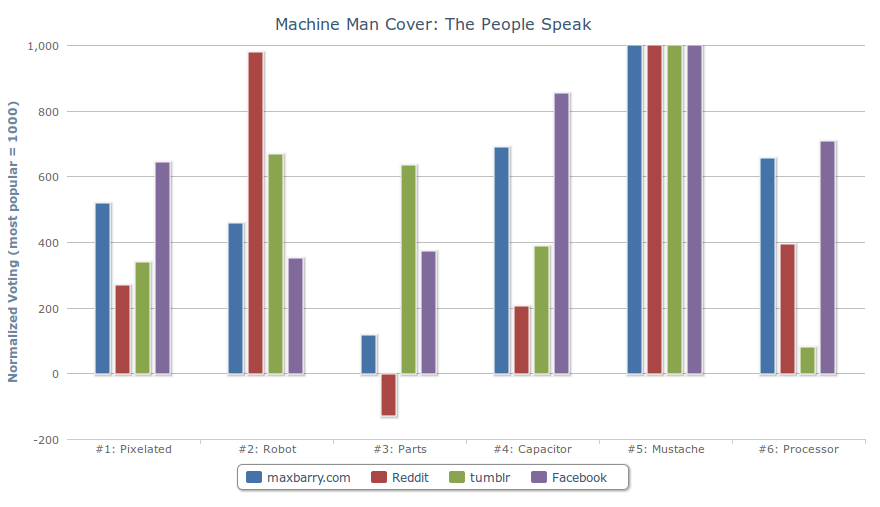
Here are the covers in question. If you’re not seeing a graph, try this. If you are, and you enjoy playing with graphs, you can click site names in the legend to add and remove them. I mention that because it’s awesome fun.
I separated votes by domain because there were interesting differences depending on whether you responded on my site, Reddit, tumblr, or Facebook.
Observations:
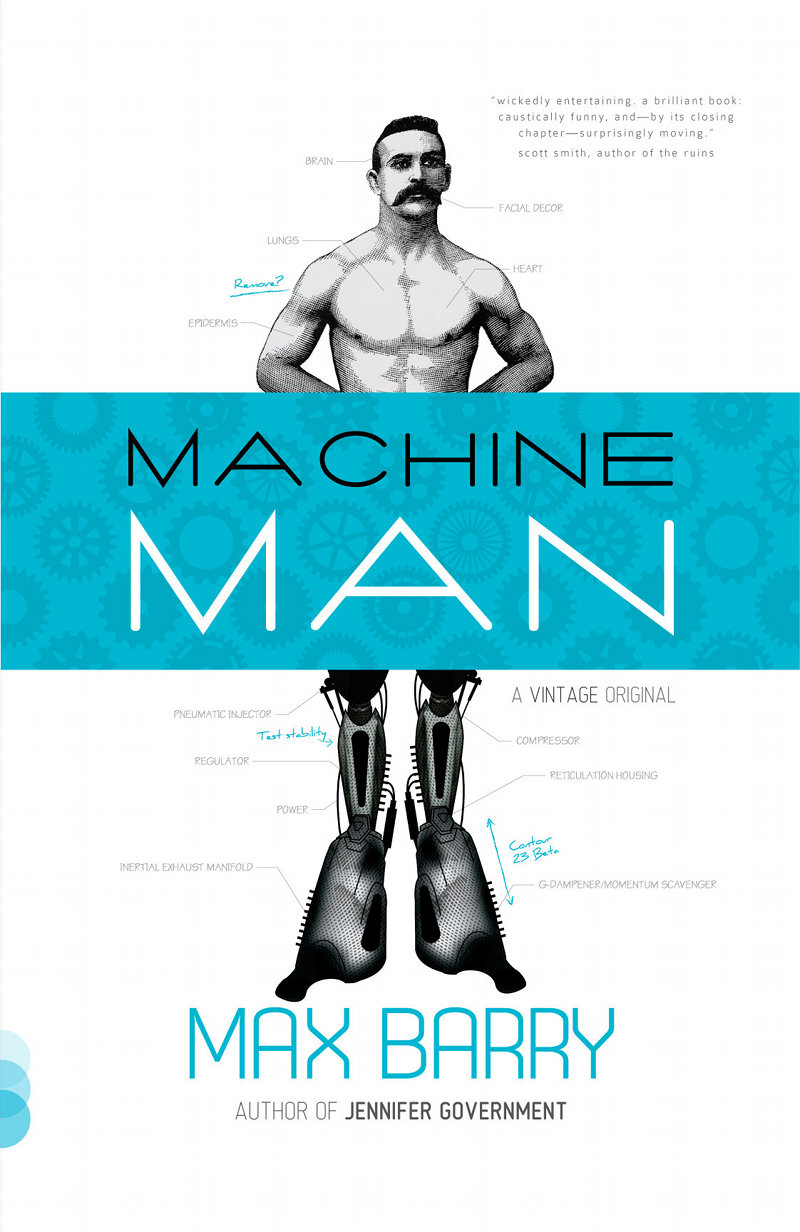
- In all cases, Cover #5 (Victorian-era dude with enormous ‘stache) was most popular. This was a surprise because I’d thought it was just too weird. In retrospect, I was probably headed for that trap of trying to imagine what other people might like, which is always a sure path to something conservative and uninteresting. So this was a handy reminder to not do that. Many people responded very positively to the originality of this design and were turned off by the same-ness of some others.
- Cover #3 (Millions o’ Parts) was least popular. This was lucky, because it was the design that started this whole debate with my publisher, and if it turned out that people actually liked it best, I would have been an asshole. The votes also seemed to back up my thesis that it appealed more to arty types than geeks, with it being quite popular on tumblr but abhorred on Reddit (where there were actually more negative comments than positive ones).
- Covers #4 (Smoking Capacitor) and #6 (Smoking Processor), which were deliberately similar to the style of my previous covers in Jennifer Government and Company, were a lot more popular with people who knew that (i.e. people on maxbarry.com and my Facebook page).
- Reddit liked Cover #2 (the Robot) a great deal, practically as much as the ‘Stache. I suspect this is due to an affection for retro robots (something I share). A few people observed that it was less true to the story than #5, though.
- Cover #1 (Pixelated Guy) I think suffered from a general feeling that this kind of thing had been done before. It was seen as pleasant but not particularly arresting.
If you were wondering, covers #3 and #6 were designed by Vintage, cover #4 by me, and covers #1, #2, and #5 by up-and-coming design superstar Matt Roeser. I didn’t mention that earlier to avoid prejudicing votes.
Comment of the week, from G Lainagier:
In numerical order: Couplandesque cubicle farce, Rankinesque steampunk, Kathy Lette tries something new, Tom Clancy for the kids of today, what you wrote, what you might write but not really this.
I also enjoyed seeing Caleb’s battle against indecision, as he transitioned over the course of three comments and several hours from saying #6 was terrible to liking it the best.
I forgot to mention earlier that most of these covers were concept sketches, not finalized designs. With #5, for example, a few people criticized the machine legs, which were only supposed to be placeholders. I’m now working with Matt and the publisher to refine that. I promise you, those legs will be awesome. Also: the ‘stache stays.
Thank you again to everyone who helped out with this. You are the burning propulsive mass beneath my rocket boots.
* Nerd details: I assigned a weighting to expressed preferences: 3 points for most preferred, 2 points for any second preference, down to -2 for last preference, if one was mentioned. When people said they liked multiple things equally, I alternated entering them in the order listed or in reverse. To allow opinions on different sites to be compared, despite very different numbers of respondents (about 260 on maxbarry.com, 390 on Reddit plus a thousand-odd votes, 70 on tumblr, and 50 on Facebook), I scaled the results: the most popular choice is scored as 1,000 and other covers based on their relative popularity on that site. A cover exactly half as popular as the top choice, for example, on whichever site, has a column exactly half as tall. Note that this exaggerates a single person’s vote on Facebook and tumblr: the Reddit and maxbarry.com columns represent many more people’s opinions.
On Reddit, where users can endorse another person’s comment by upvoting it, I multiplied the score of each comment by the number of upvotes. But since users can upvote multiple comments, even comments saying the same thing, I took the square root of each result in order to minimize the exaggeration that would have otherwise occurred. (Without this, the more popular covers on Reddit appeared wildly more popular.) When highly upvoted comments expressed equal preferences for multiple covers, I assigned equal scores, rather than relying on the averaging nature of the alternating system mentioned earlier.
 27 comments
Choose the Machine Man cover!
Something wonderful happened the other week: my editor asked what I thought about a proposed Machine Man cover. To appreciate how wonderful this is, you need to understand the usual process of publisher-author cover consultation. It goes like this:
- Publisher develops cover in secret laboratory guarded by Dobermans
- Publisher emails author a JPEG, accompanied by text emphasizing how much everyone they’ve shown this image to loves it and believes it to be a surefire winner
- Publisher puts image on the cover
You notice there are no steps where the author does anything. I have tried to insert that step in the past, first with Syrup and then Company, but without much success. (To be fair, I was wrong about Company. That is a great cover. I was right about Syrup, though.)
This time, however, my editor at Vintage was ready for discussion. I don’t know why. I didn’t want to ask in case that accidentally provoked him into regaining his senses. But I made a few suggestions, even mocked up prototypes of my own, and Vintage responded with even more images.
Then I became really arrogant and demanding. It was around this point I realized why publishers don’t involve authors in cover discussions. Because I still wasn’t really in love with any of the cover ideas we had. And the cover is so important. Not just because it helps sales (although there is that): it also colors the story within. It’s the first thing you see and it stays with you as you turn the pages.
So next we brought on board indy designer Matt Roeser. This guy is incredibly talented and has somehow not been hired by anyone yet: this is potentially his first gig. Go look at his website; it’s beautiful. Anyway, once Matt had done his thing, we had six potential covers. Since I was already being a prima donna, I said, “I should post this online and ask people what they think.” And Vintage agreed! Like I say, it’s crazy. So here we are. Behold!
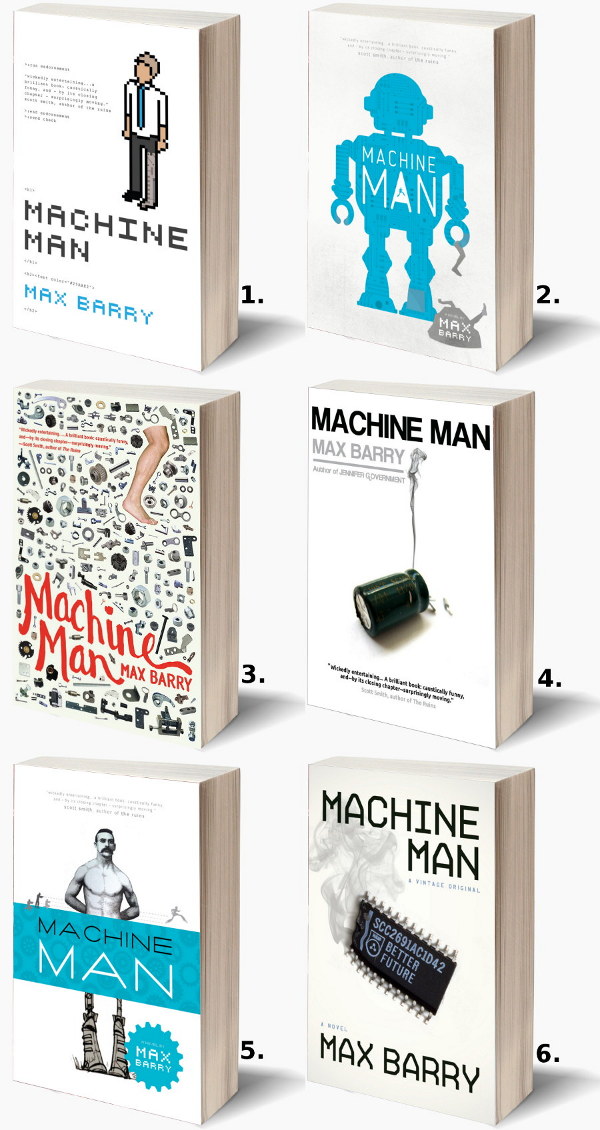
Here are larger versions of each image: 1 · 2 · 3 · 4 · 5 · 6.
Now we reach the part where you tell me which you like. There’s a comment link right there. I also posted to Reddit, because that’s where I drew a lot of inspiration for my main character’s personality. I’m not saying the site is full of misunderstood technology-obsessed geeks who would chop off their own hands if they could replace them with something WiFi-enabled. I’m just saying it was very helpful creatively. Also, I thought it was important to get opinions from people who don’t already like me. You’re wonderful people, you who visit me here. But you’re one hell of a sampling bias.
Please let me know what you think! Any and all feedback is much appreciated. And thank you to Vintage for being cool enough to let me do this. INSANELY COOL, if you know what I mean. I’m emphasizing INSANE. Oh. You got that? Okay.